Dream11 · Mobile
Product Designer · 2026
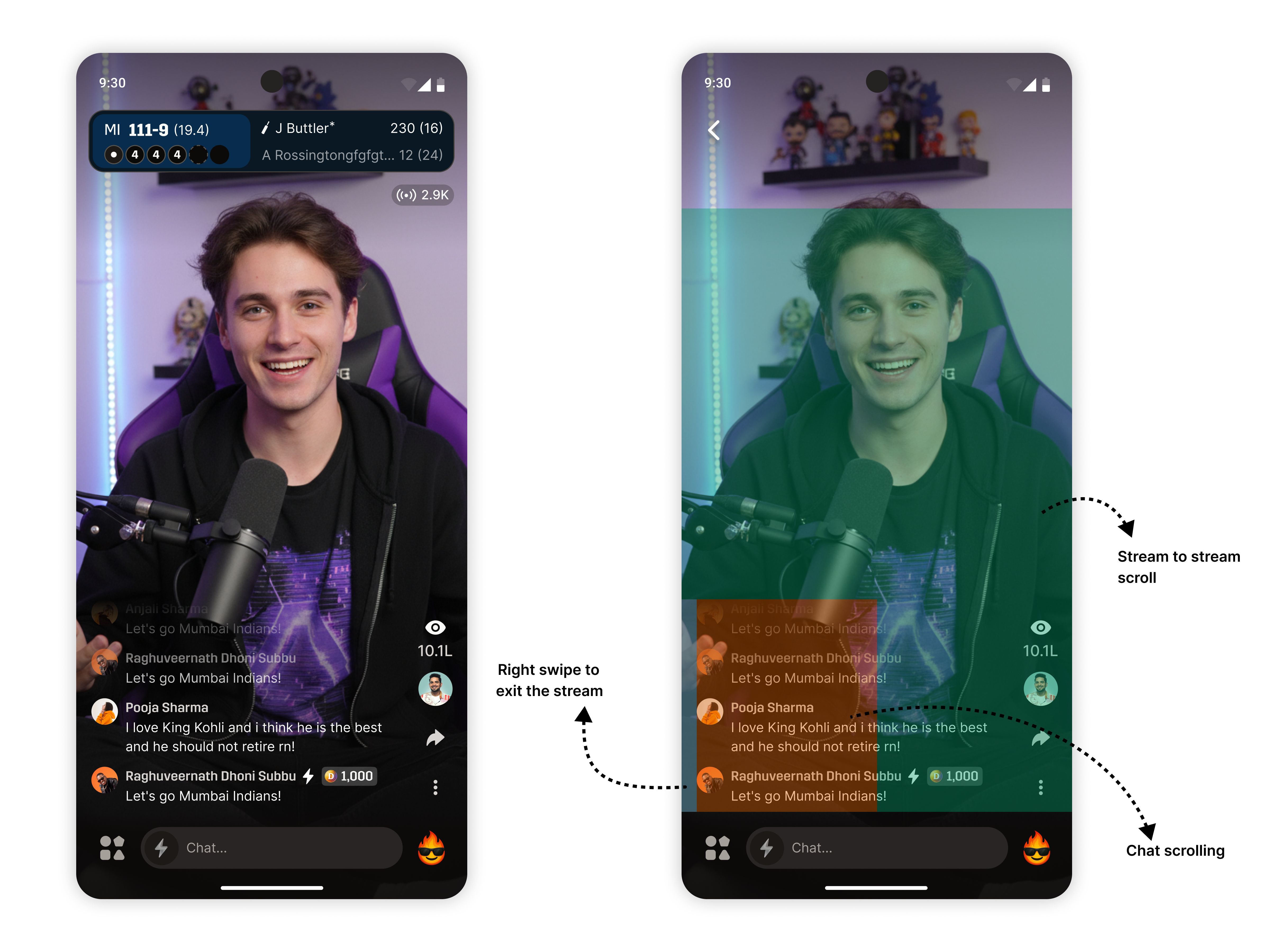
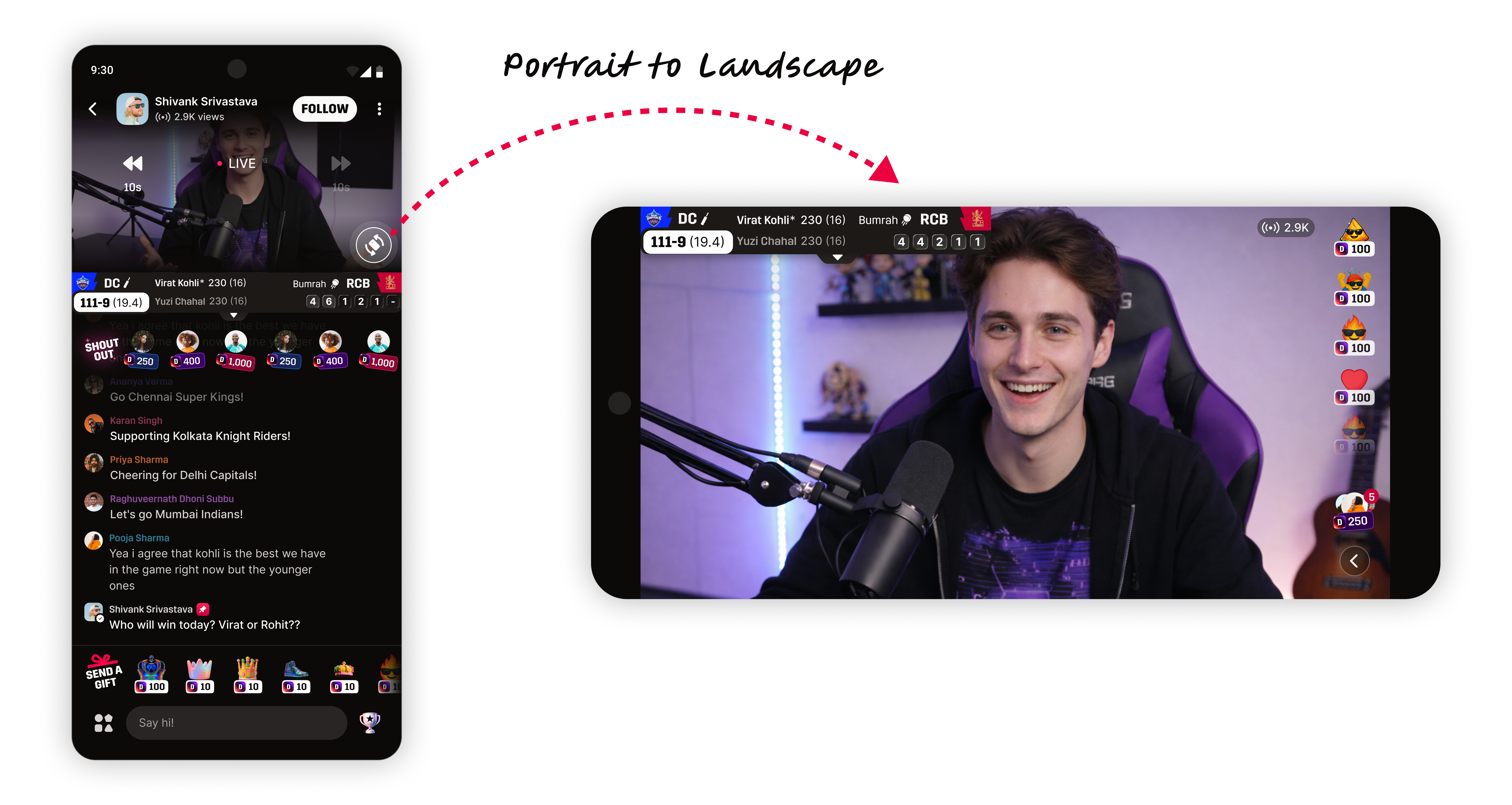
Watch Along Landscape.
Our live stream watch time was dead in the water at 2.3 minutes. Throwing more engagement features at it didn't help. The real fix? Making people turn their phones sideways.
The problem
Portrait mode trained users to browse and bounce. Watch time was stuck at 2.3 minutes and more features weren't moving the needle.
The solution
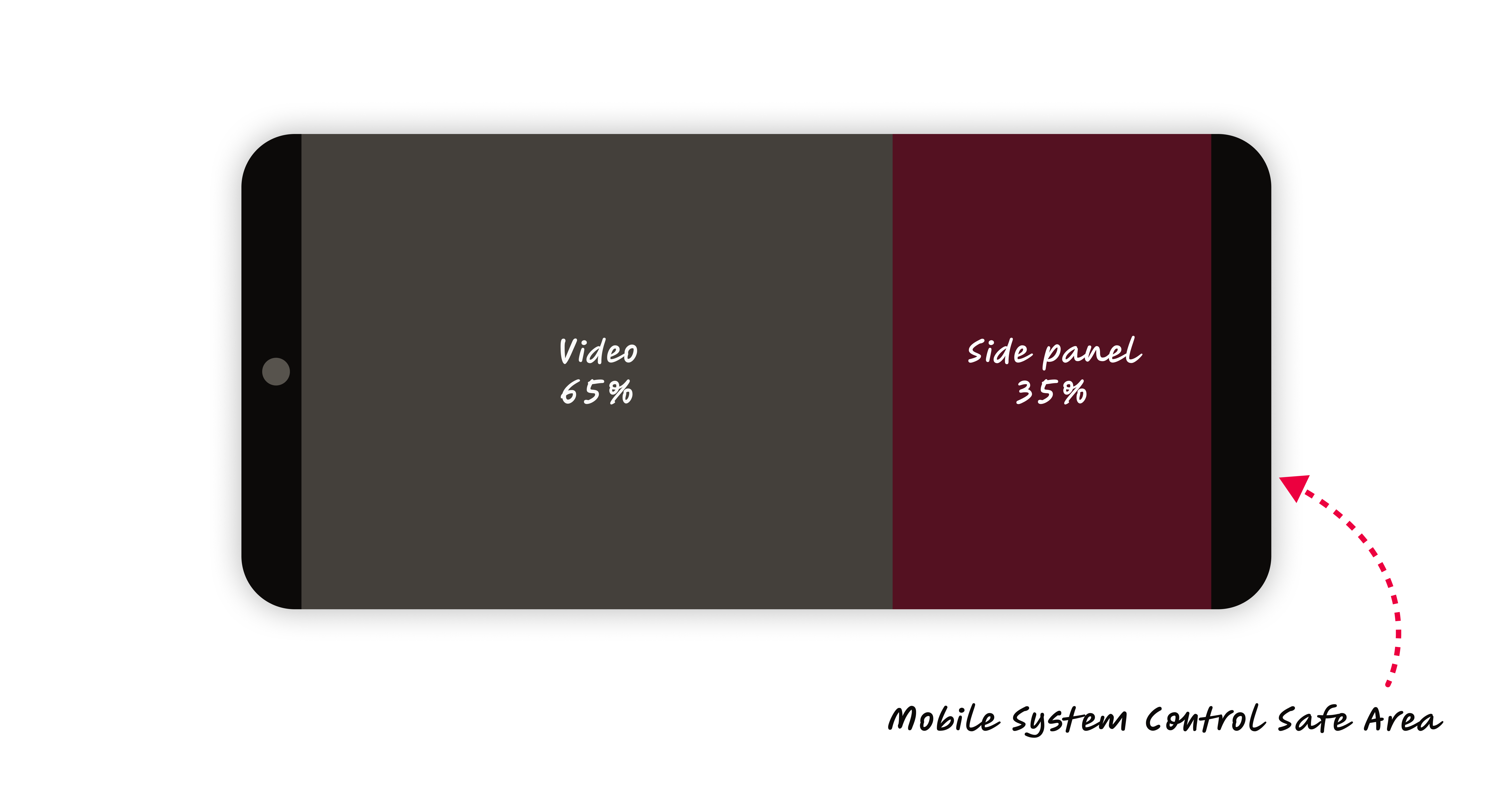
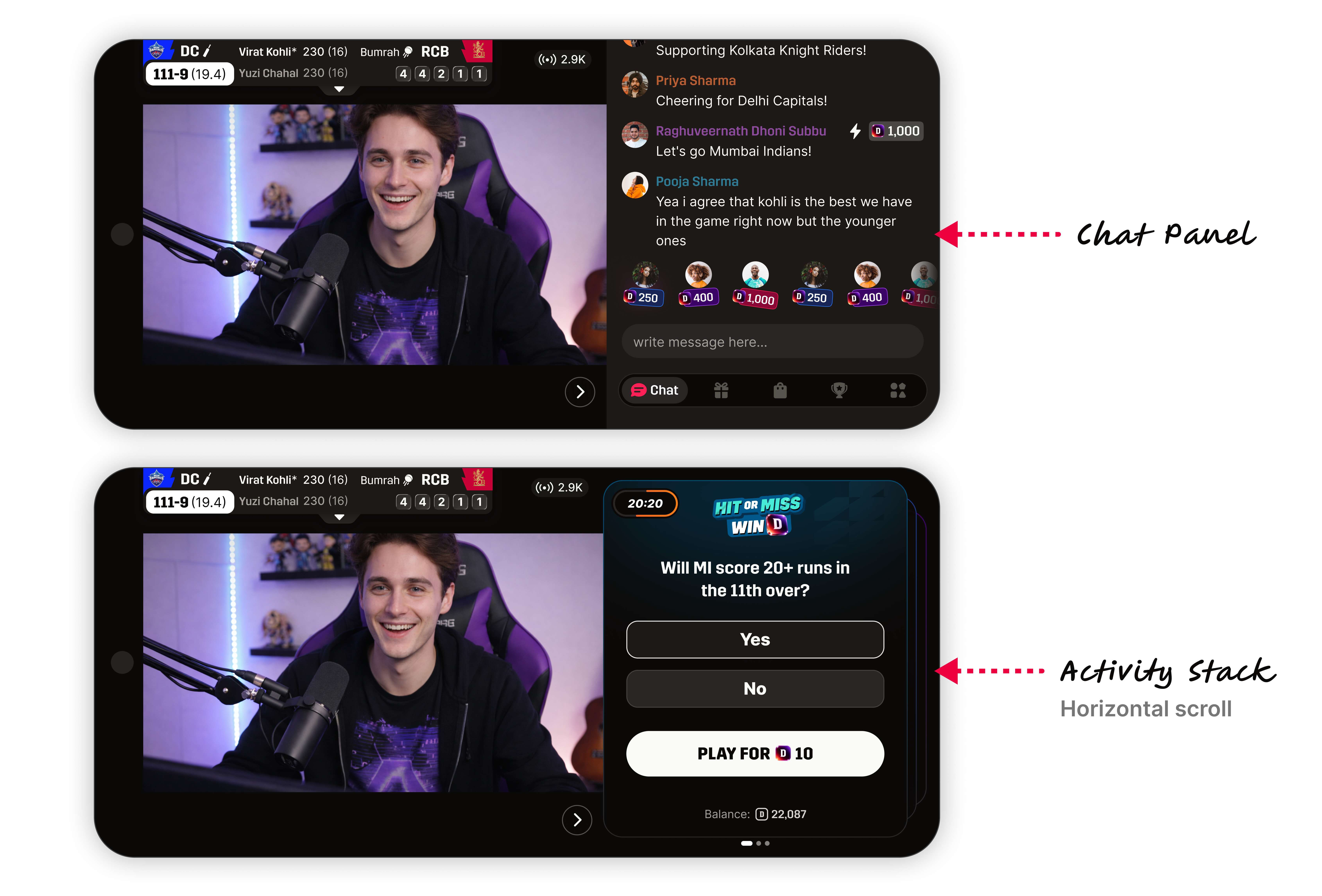
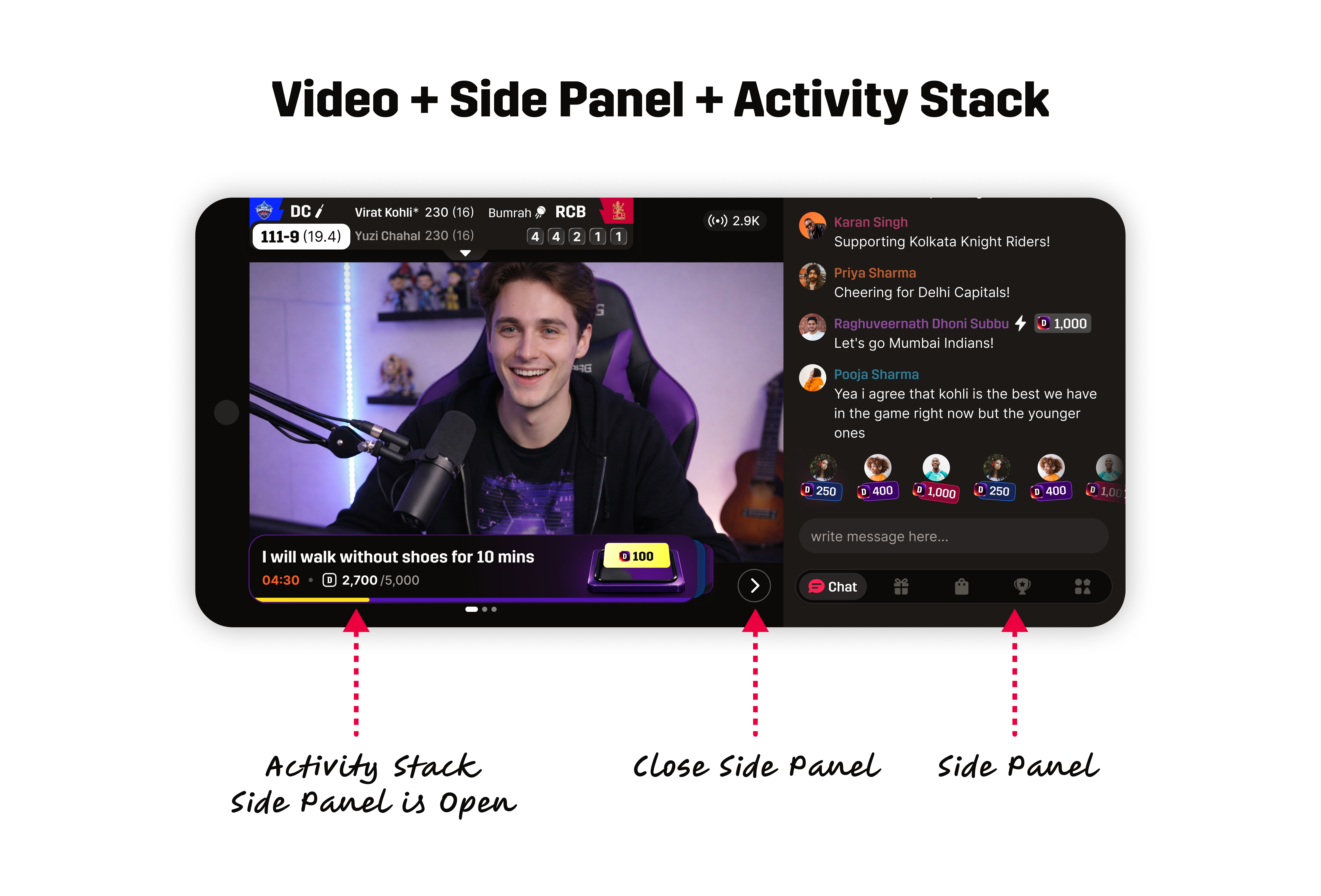
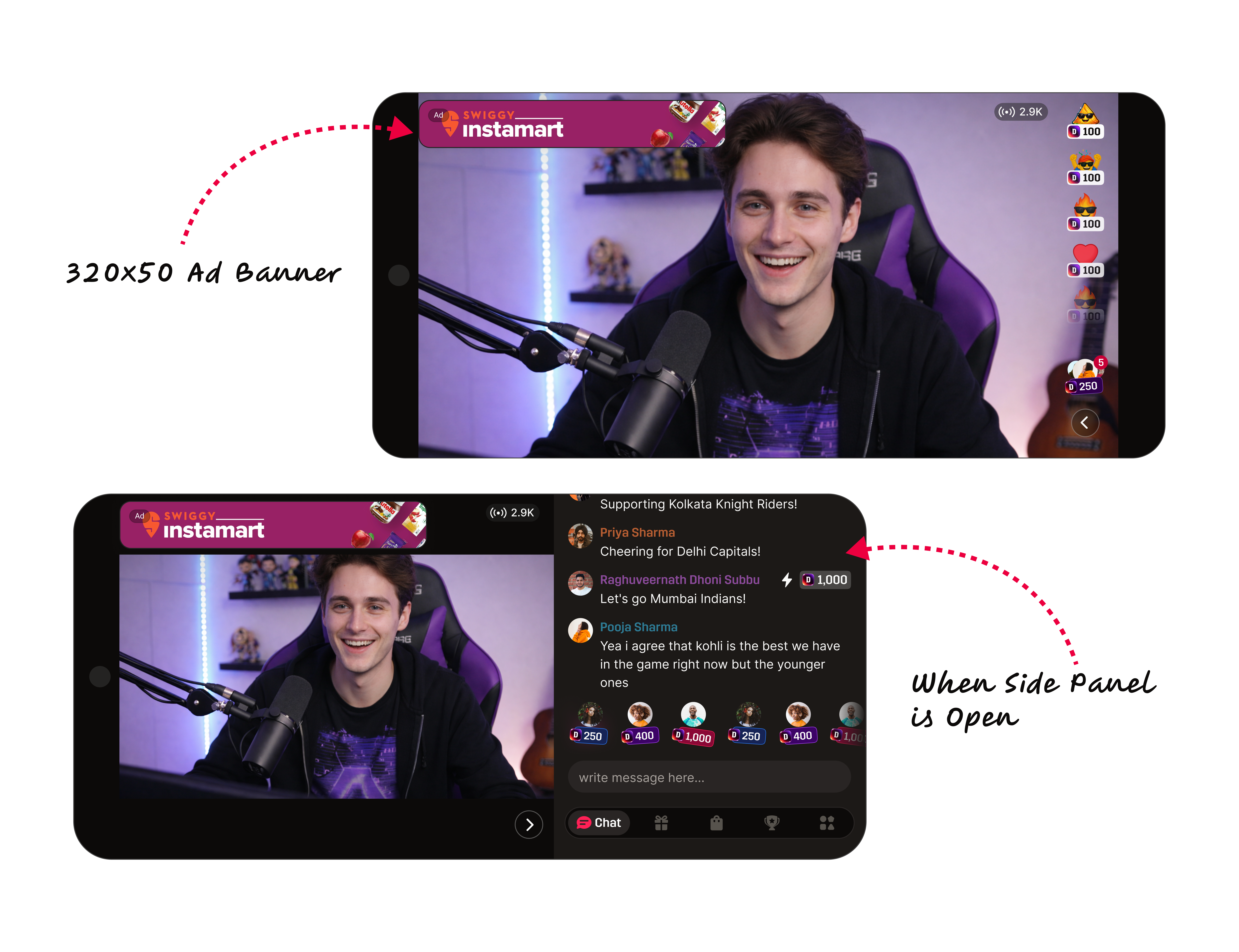
A posture change. We rotated the phone to landscape, gave video 65% of the screen, and moved interaction beside it. Watch time jumped to 15.2 minutes.
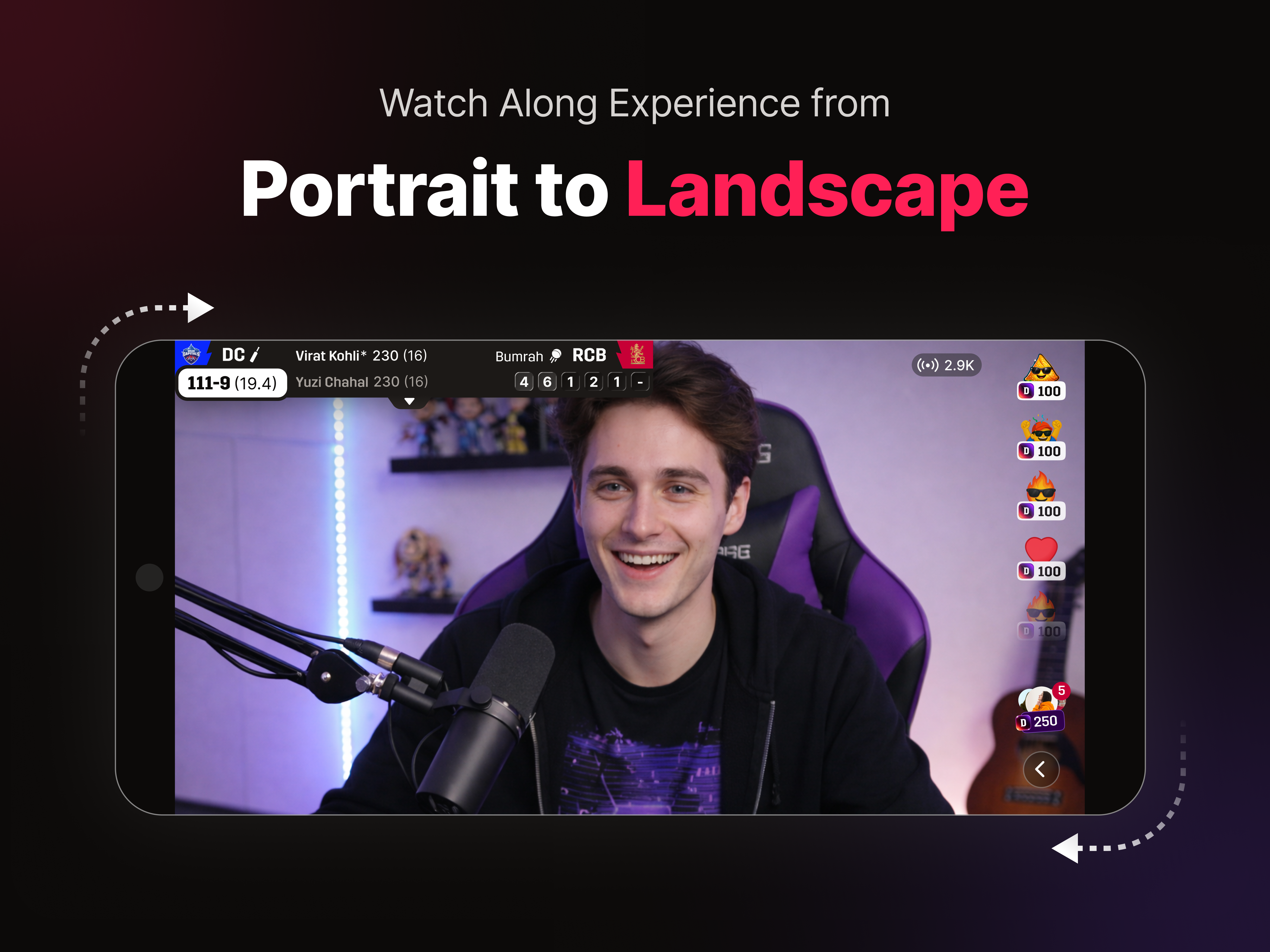
15.2MIN
Landscape watch time
2.3MIN
Portrait baseline
6.6×
Watch time lift