Our live stream watch time was dead in the water at 2.3 minutes. Throwing more engagement features at it didn't help. The real fix? Making people turn their phones sideways.
Portrait mode trained users to browse and bounce. Watch time was stuck at 2.3 minutes and more features weren't moving the needle.
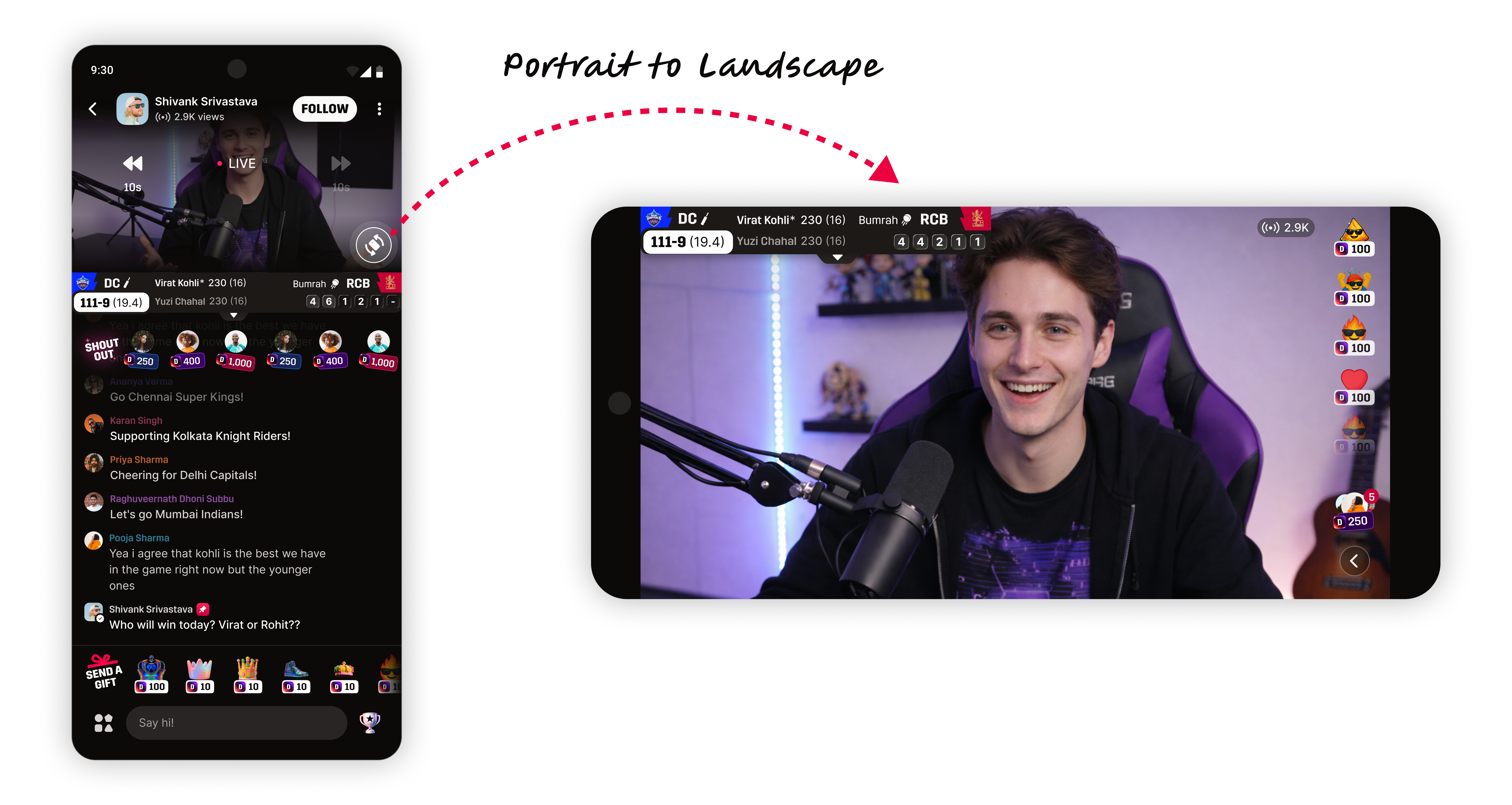
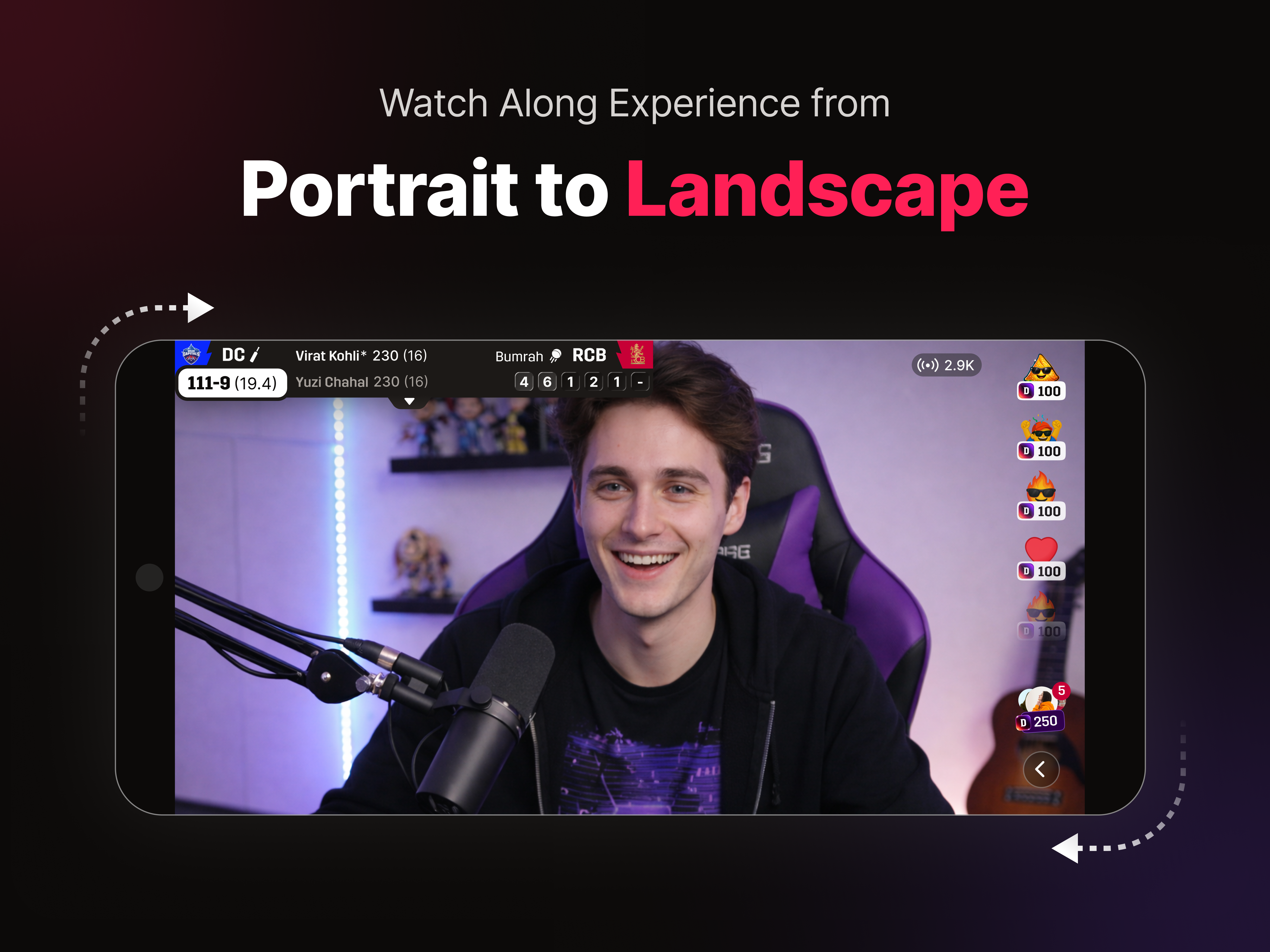
A posture change. We rotated the phone to landscape, gave video 65% of the screen, and moved interaction beside it. Watch time jumped to 15.2 minutes.
My team owns the metrics for whether users are actually watching or just passing through. Watch time was stuck at 2.3 minutes, and leadership wanted it up.
Our first instinct was more polls and gifts to give people a reason to stay. Activity went up; watch time didn't budge.
A PM and I were just chatting when it hit us: why is every other long-form live app in landscape, but we're forcing portrait?
Every other long-form live app treats landscape as the default. The only portrait holdout was TikTok - and that's for short loops, not a 90-minute cricket match. We didn't need a layout refresh; we needed a posture change.
Our product was acting like a casual TikTok feed - terrible for long-form sports. We had to shift the user's posture from "browse and leave" to "rotate and watch."
Our features weren't bad. The format was just wrong. We were putting 90-minute matches into a highly interruptible container. The issue was purely posture.
This wasn't a months-long research sprint. We just looked at the top platforms and realized the pattern was undeniable.
Every platform built for long sessions defaults to landscape and side panels.
Landscape · 16:9 · side-panel interaction - the default for serious viewing.
Watch time was our true north star. Chat and activity health were our secondary reads.
Design principle - video first. Interaction beside it.
I owned the fully rotated landscape mode - making the behaviour-shift thesis a reality.
This wasn't just slapping a chat panel on the side of a video. We had to keep users engaged without letting the UI run over the stream.
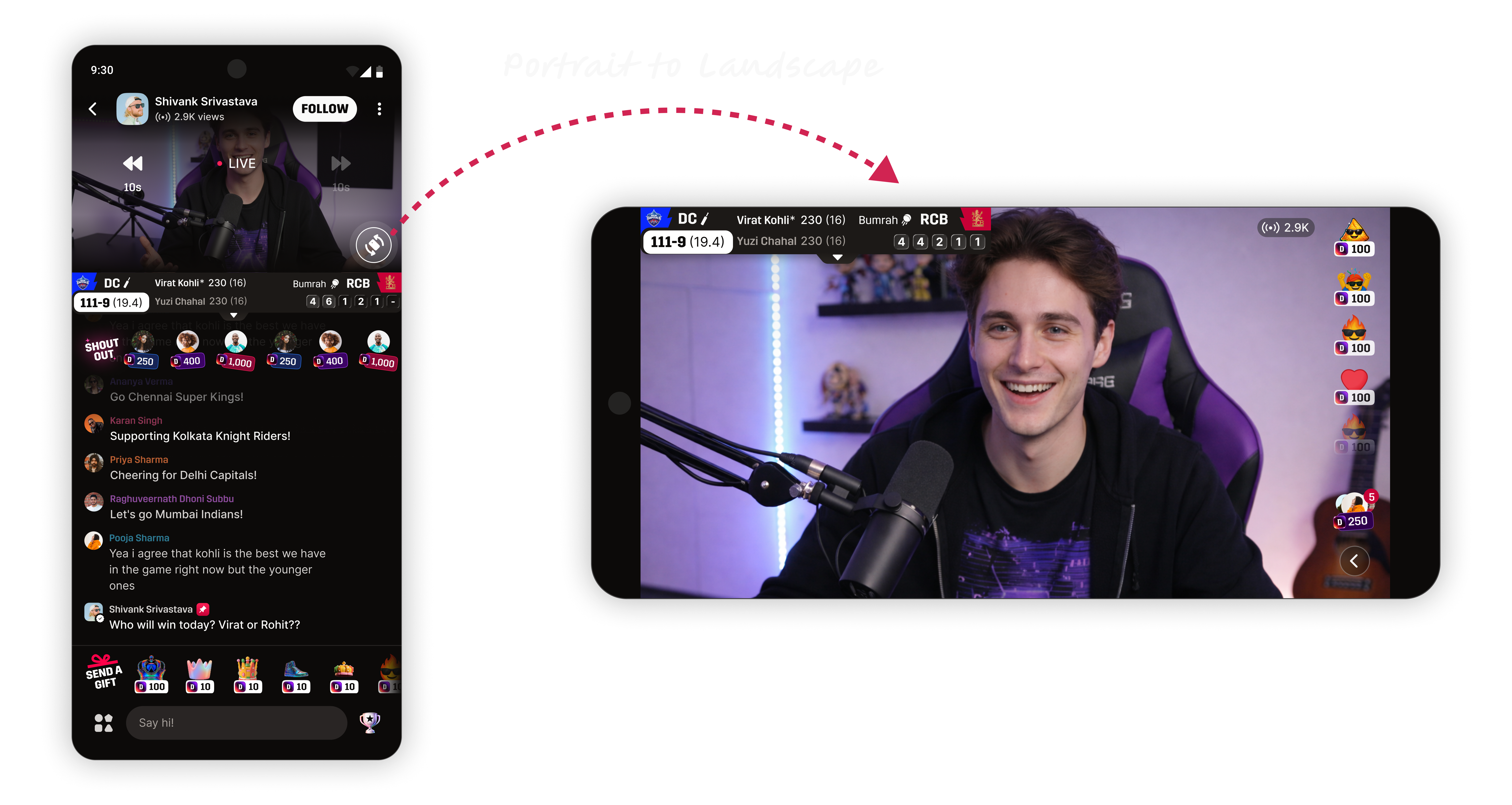
Make video worth rotating for. Rotate the phone and video instantly takes the center - the portrait feed shifts into a 16:9 watch posture.
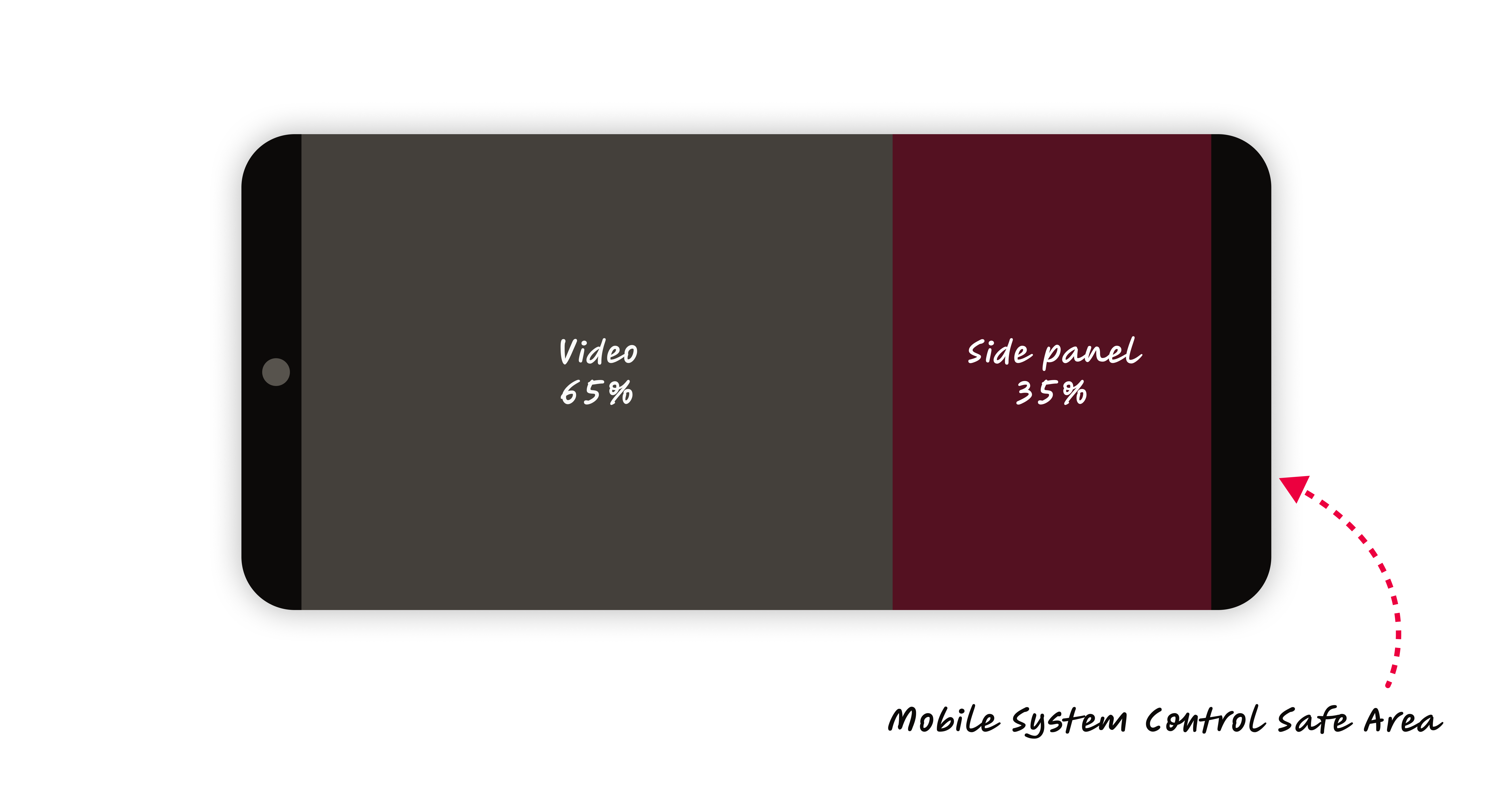
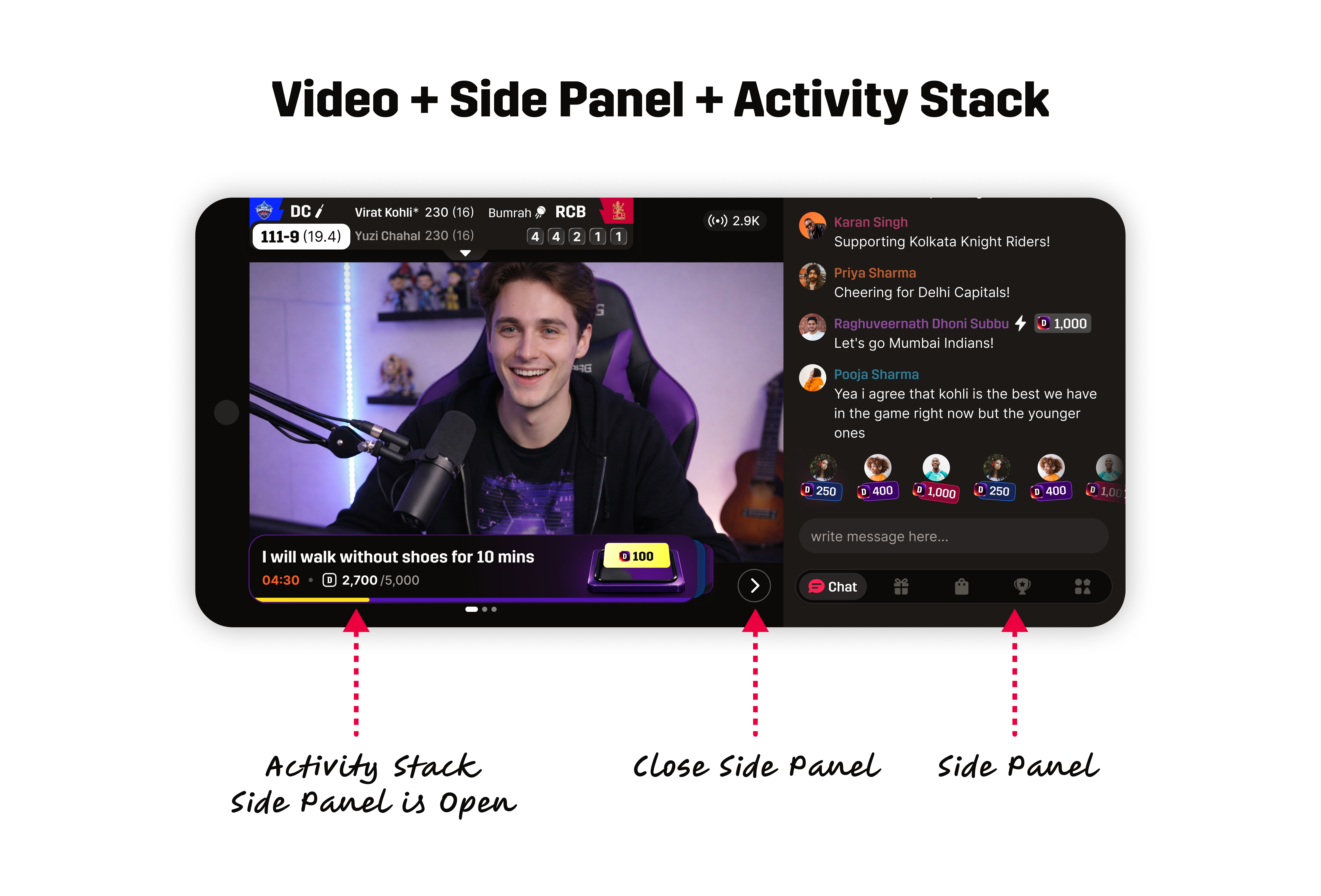
A 65 / 35 split. We gave chat just enough room without crowding the stream - video holds 65%, the side panel takes 35%.
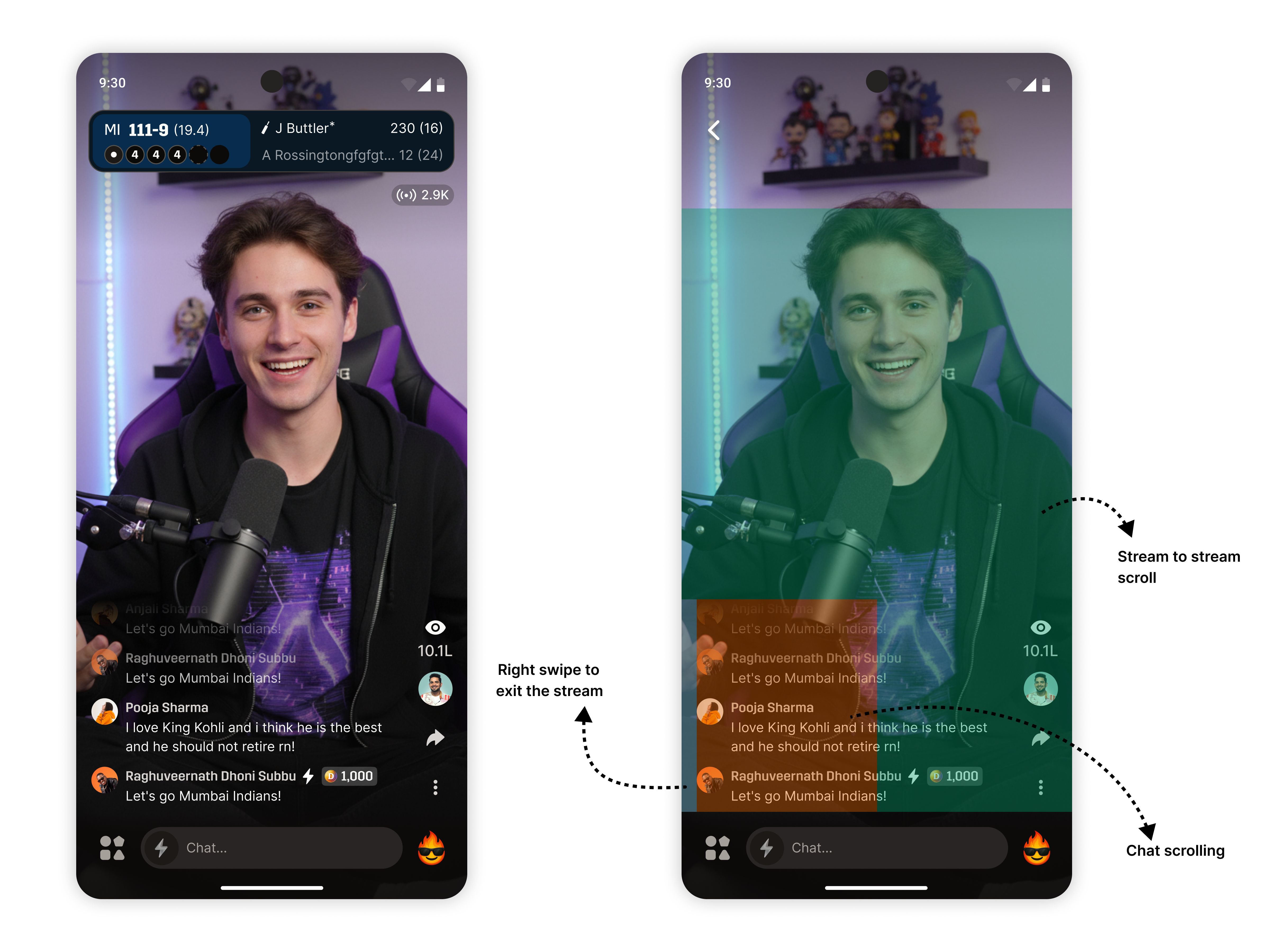
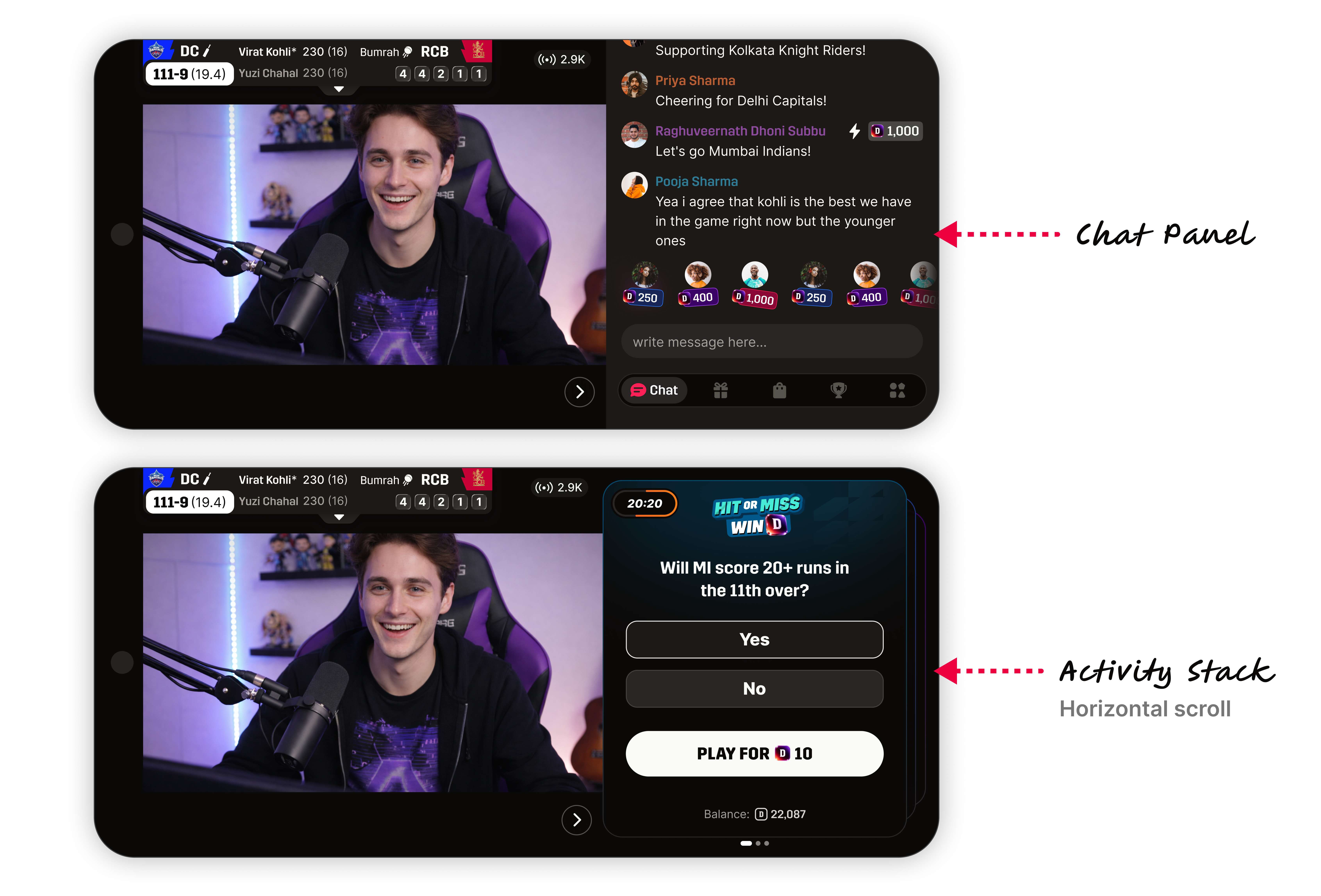
Overlays move sideways. We didn't delete anything, just repositioned it to the side rail - chat, gifts, and polls are still one tap away.
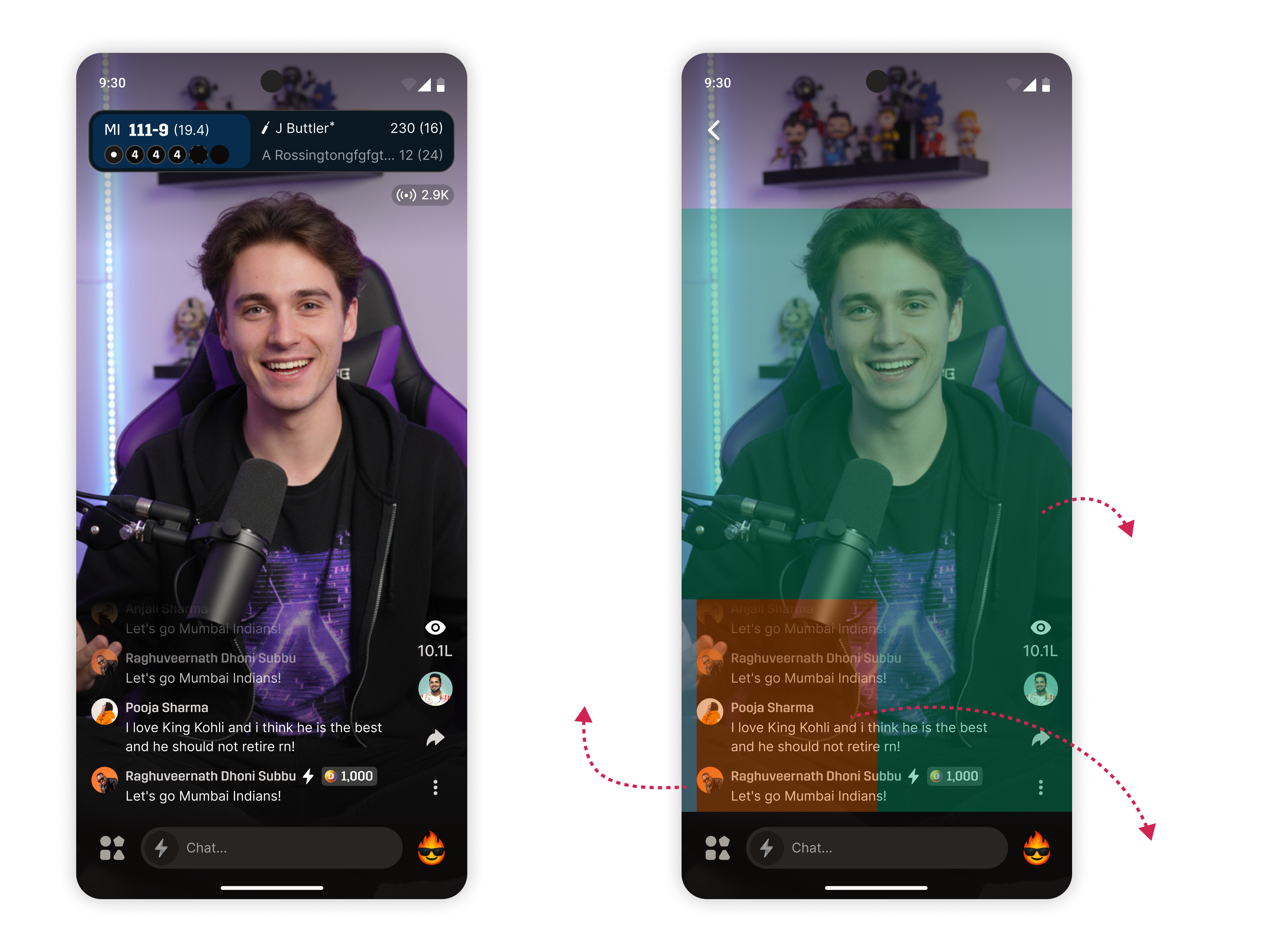
The stream holds the left two-thirds. Chat and activities take the right rail. Overlays pop up inside the video so they don't break the watch posture.
Focusing on the stream forced us to make difficult UI tradeoffs.
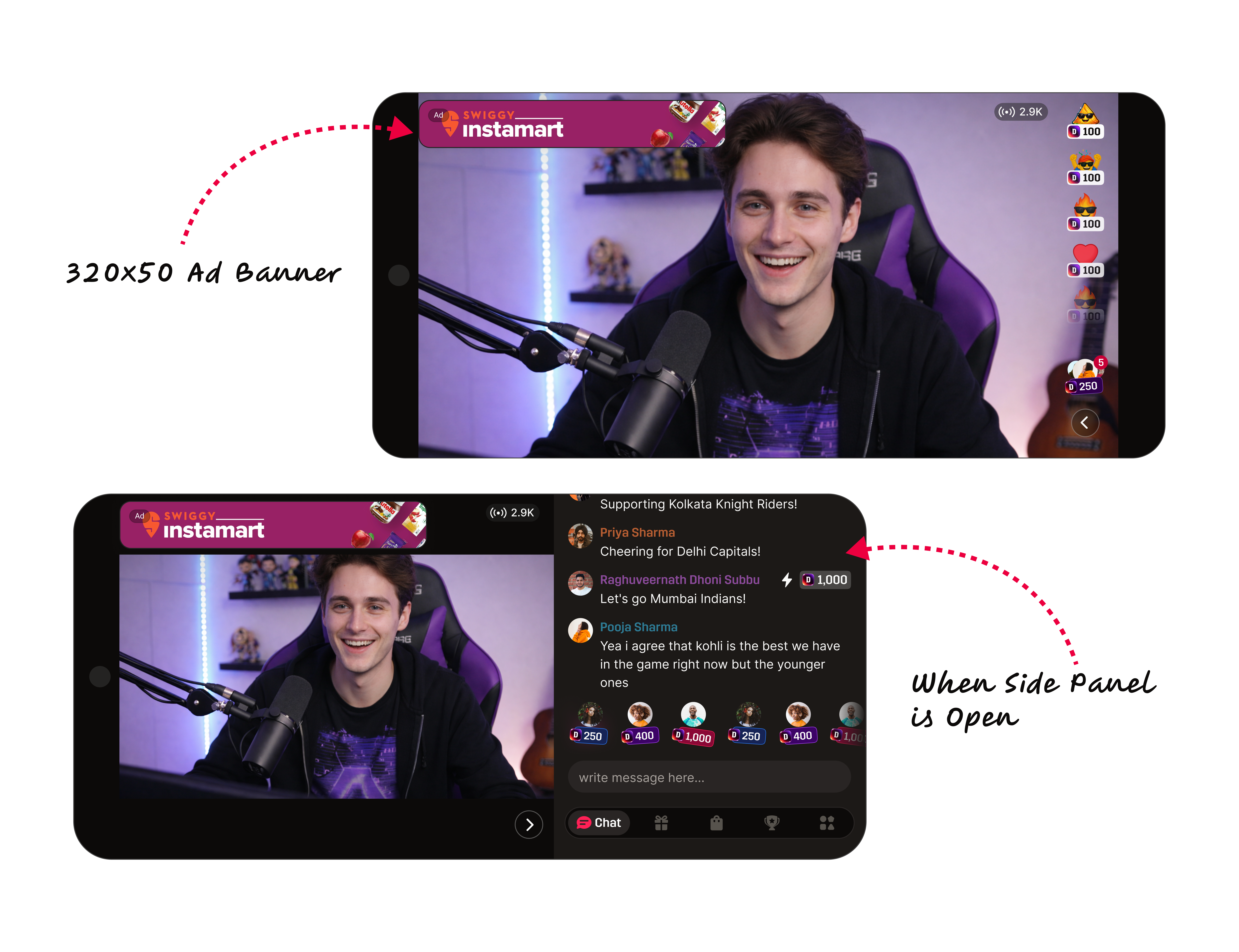
Ads pay the bills, so removing them was a non-starter. We shrunk them to 320×50 units - visible, but out of the way.
320×50 is a standard that already performs well; full-size ads competed with the watch posture.
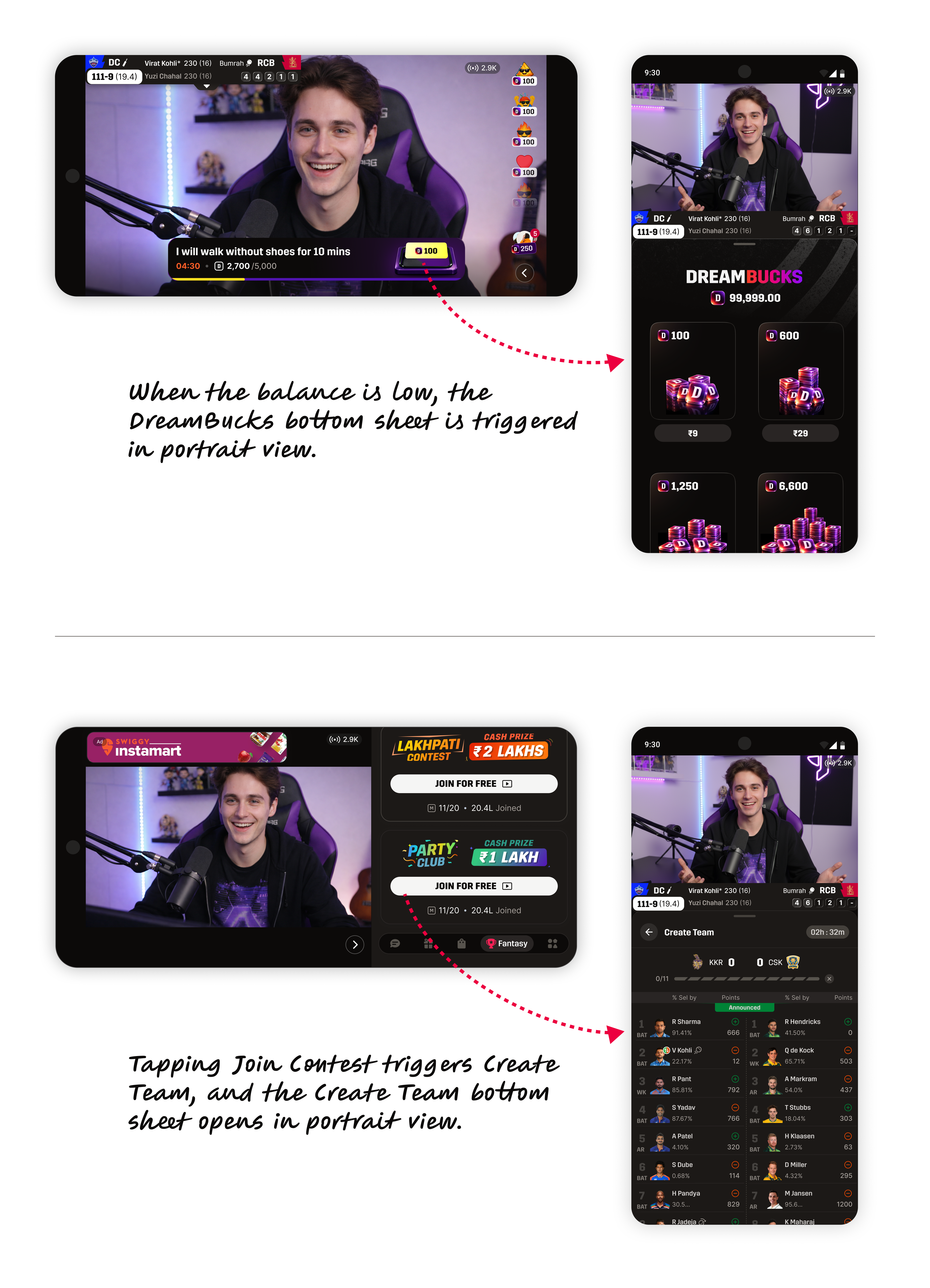
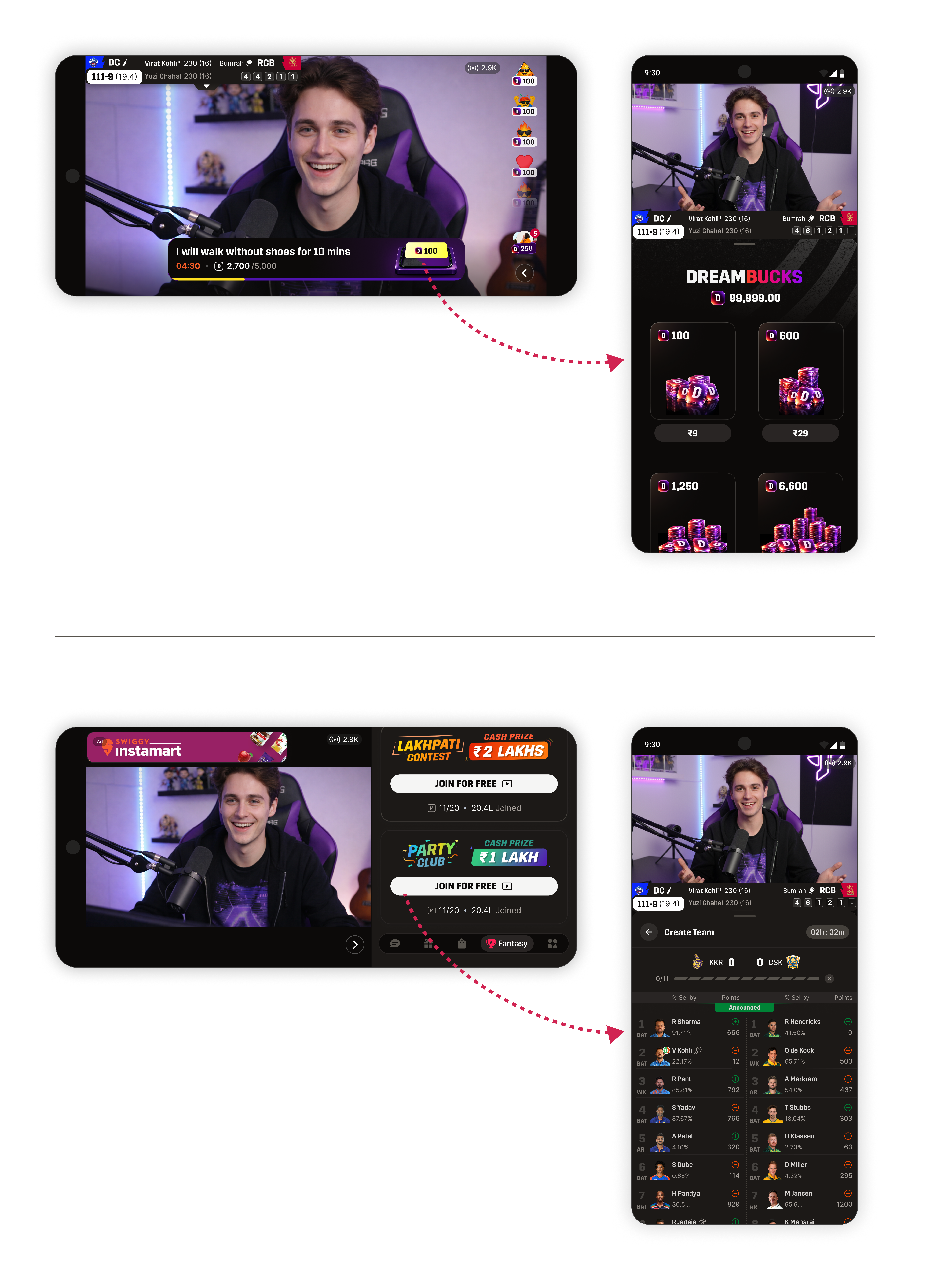
Team creation was too heavy to squeeze into a side panel alongside video and chat. So we shift the phone back to portrait for those tasks, then flip back to watch: landscape → rotate to portrait (create team, buy DreamBucks) → rotate back to landscape.
Fantasy was already native to portrait everywhere else, so the rotation kept the mental model intact.
The first month validated our bet: this was a fundamentally stronger way to watch.
Average watch time · first-week landscape sessions.
Average watch time per user before the orientation shift.
Conversation held steady, but polls softened slightly because we explicitly made the video the star.
We didn't fix watch time by decluttering. We changed the story: less browsing, more staying.
We didn't wait for perfect certainty - strong product judgment was enough to move fast.