Our 250M users treat match day like a festival, but they had nowhere to hang out together on the app. We gave them a digital room — creator-led, real-time, built for cricket.
Fans watched across five apps at once — fantasy scores here, live commentary there, group chat somewhere else. The stadium energy was totally fragmented.
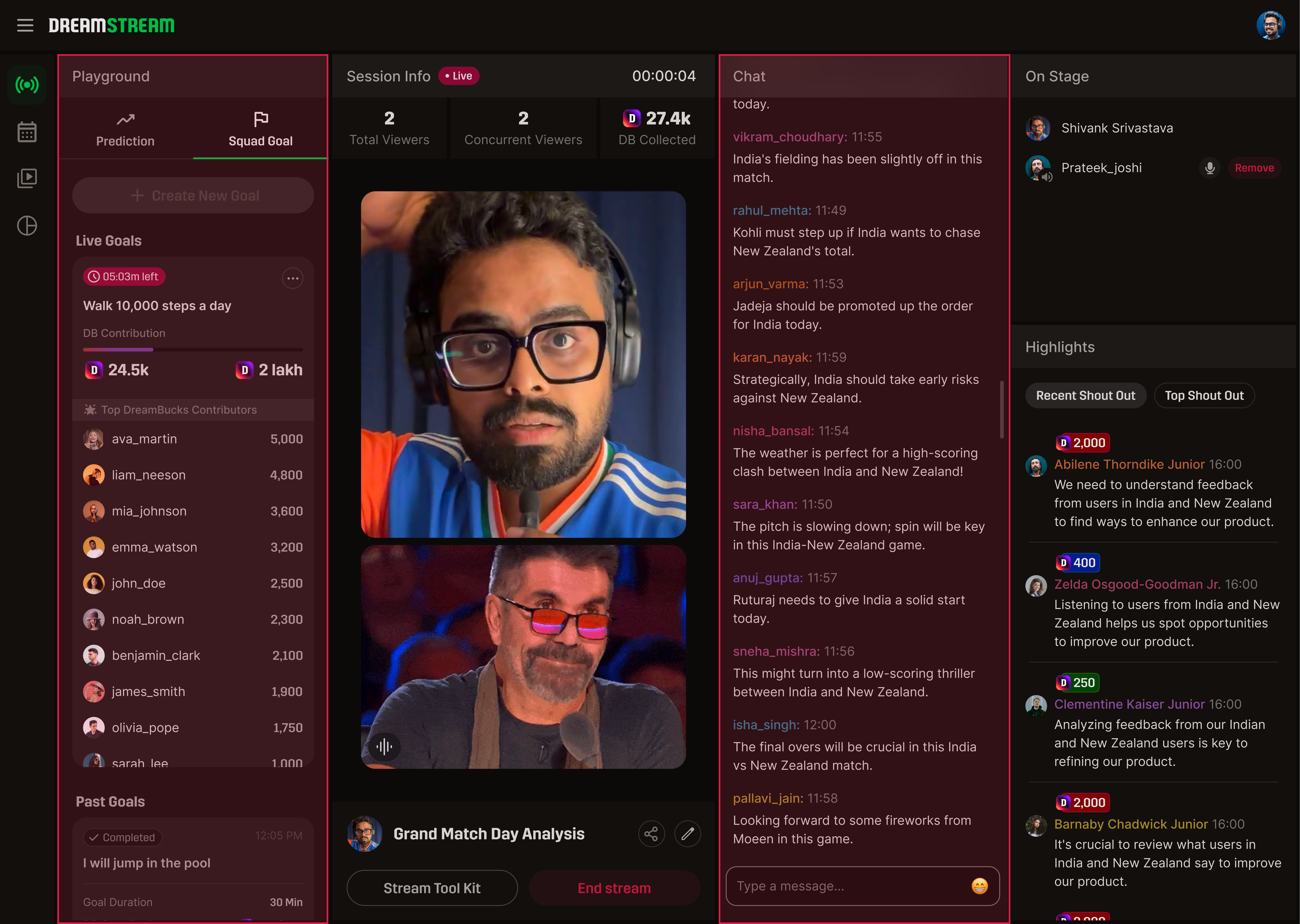
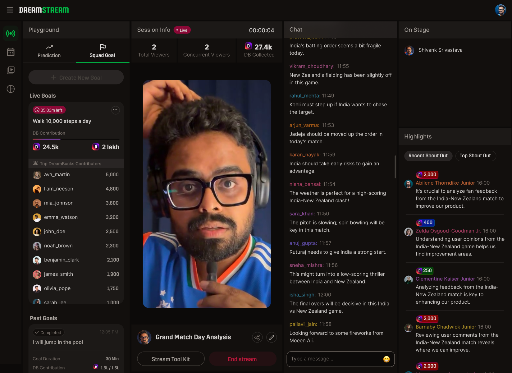
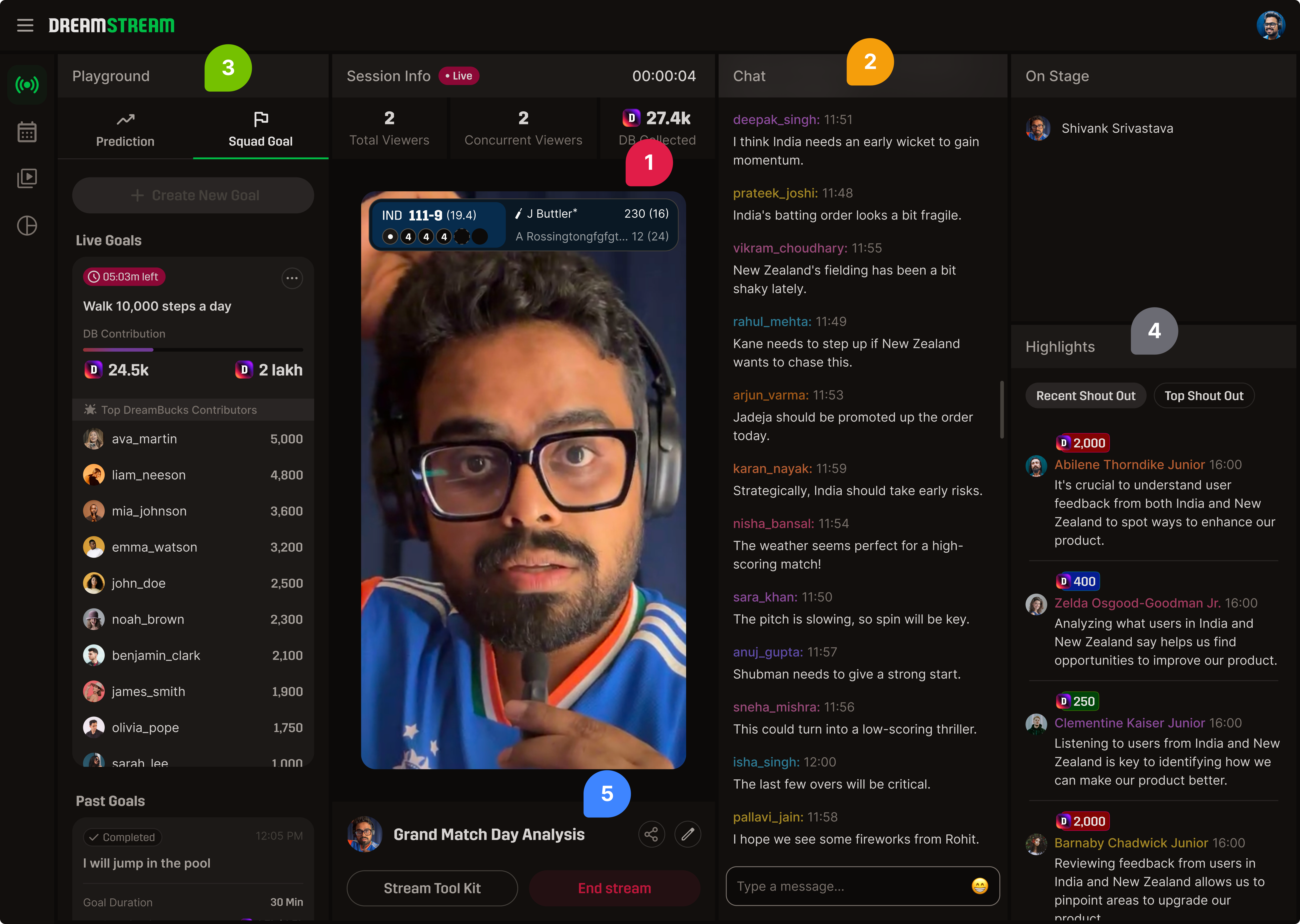
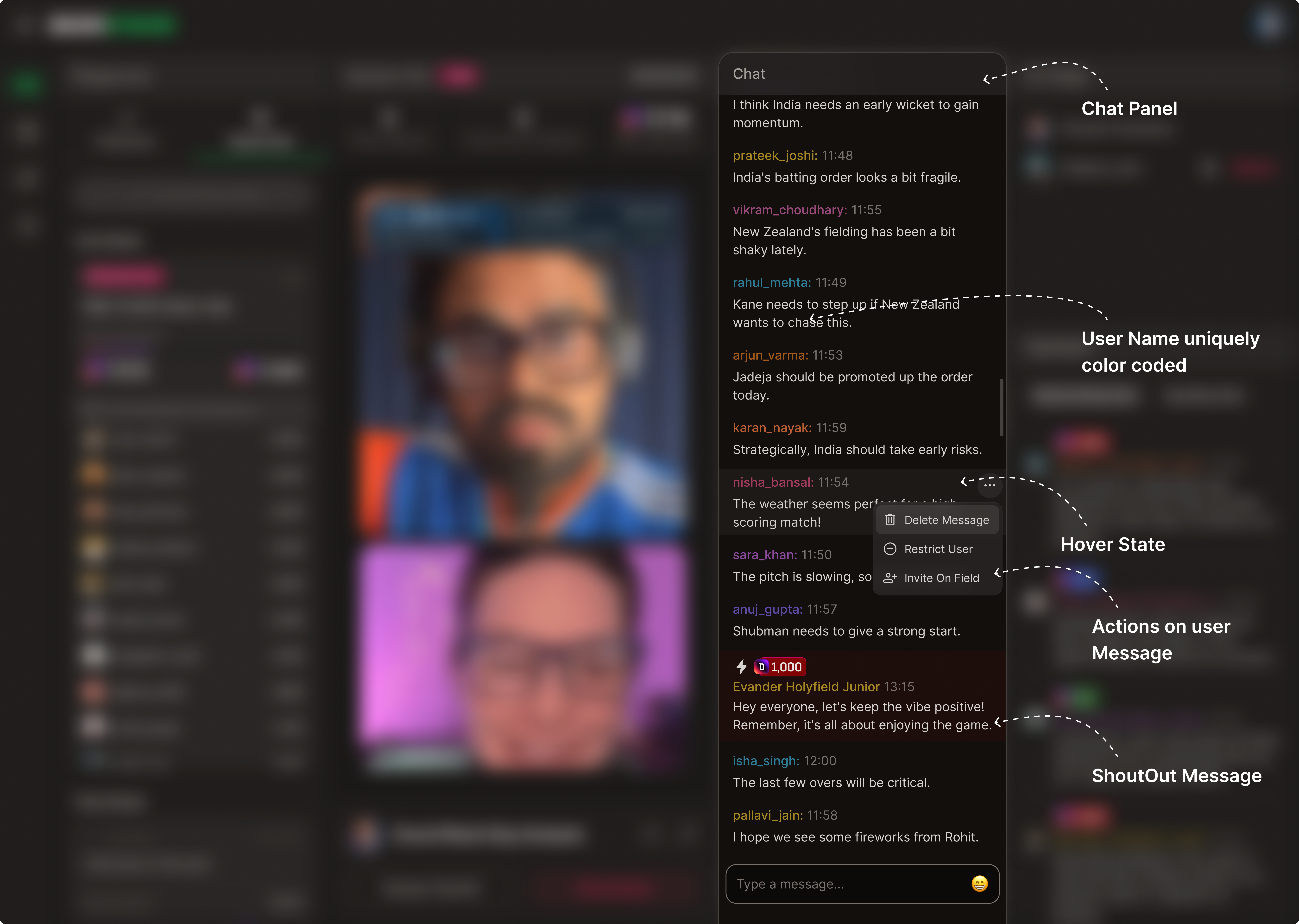
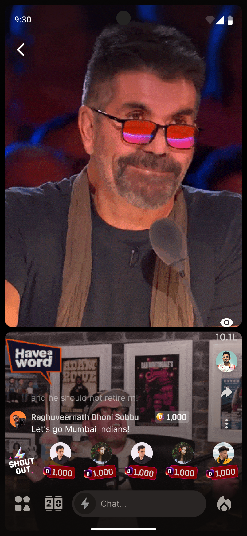
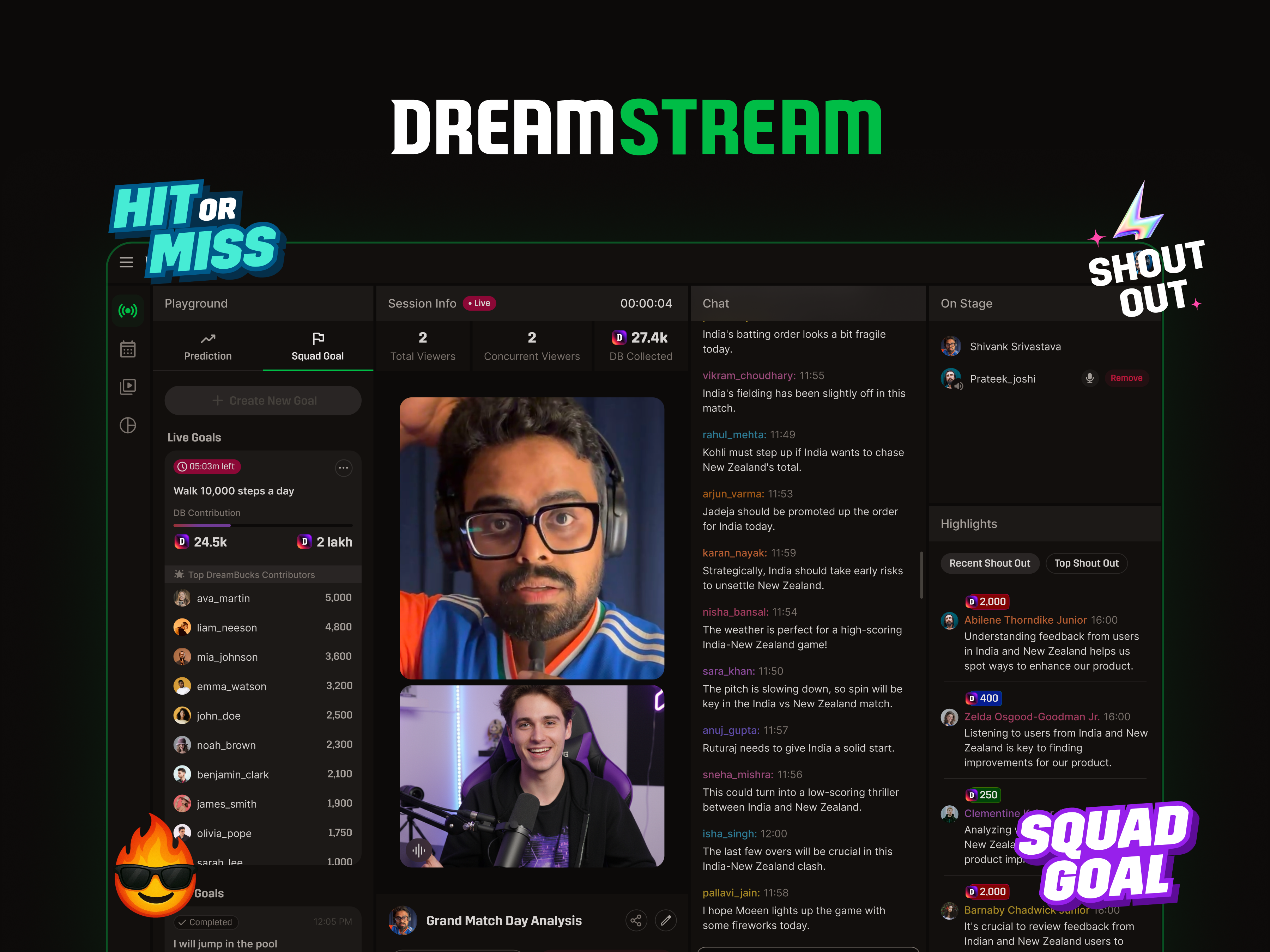
A live creator console. Verified creators host real-time rooms with commentary, polls, and shout-outs — one screen for everything match day.
Our fans treat match day like a festival, but they had absolutely nowhere to hang out together on our app.
Leadership gave us a simple mandate: build a communal space where fans can experience the match together.
Watching a match at home meant staring at five different apps at once. We wanted to pull all that scattered stadium energy into a single screen.
Five apps, one match. DreamStream collapses the whole room into a single surface.
We used engagement tools as the bridge between playing fantasy sports and feeling like you're in a crowd.
With only 60 days, we skipped the massive research phase and went straight for quick, dirty answers.
Twitch, YouTube Live, Kick and OBS - to see how creators actually work.
We literally grabbed creators from our onboarding cohort visiting the office for fast feedback.
One hour with Charlene from Twitch - don't repeat mistakes mature platforms already solved.
Sat with the internal moderation team - moderation is a hidden nightmare we had to design around.
This 1-hour call saved us weeks of trial and error:
If the tools are annoying, creators won't stream. Fix friction first.
Most viewers lurk, but chat still needs to look alive.
Give creators interactive tools that create instant talking points.
People love feeling like insiders. Badges work.
Growth happens after the stream ends, when clips get shared.
If the audio is bad, people leave. Period.
We hacked together a playable prototype just to see where our mental models completely clashed with the creators' habits.
Who saw it - stakeholders across product, content and ops; three creators already onboarded for contracts; one moderation lead.
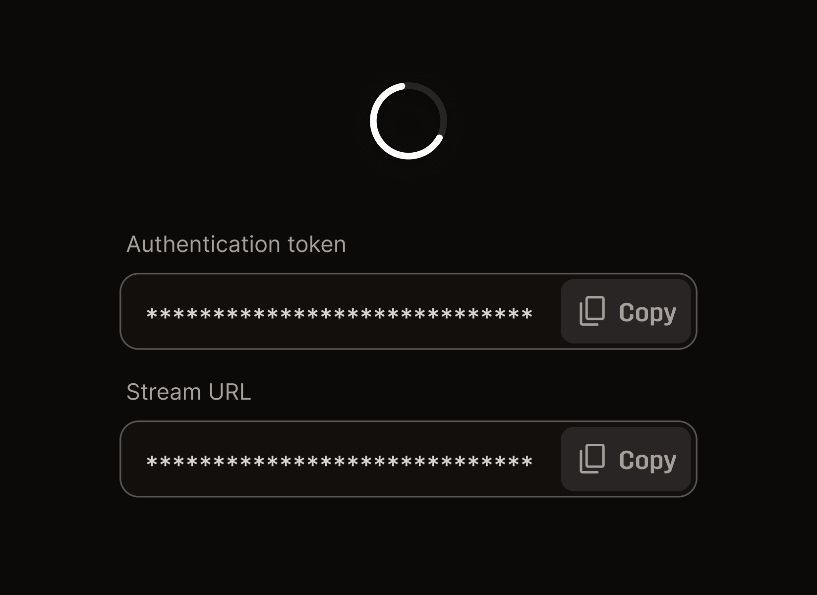
What it asked - could a creator go from login to live in under a minute, using their existing OBS muscle memory? Where did the flow break down for them?
Assumed: creators care most about chat features. Learned: they only care if the tool helps them make better content - so chat became something for the creator to react to.
Assumed: we need tipping on day one. Learned: smaller creators want loyalty first, big ones monetize elsewhere - so we held tipping and pushed recognition instead.
Assumed: fans want a massive, complex dashboard. Learned: they just want to feel the energy of the room - so we optimized for visible motion.
Saying "yes" to these limitations is the only reason we shipped on time.
We designed around the engineers so they could focus purely on video stability.
We built around OBS rather than trying to compete with it.
Our poor CS team handled the massive load of moderating manually for V1.
We built basic components instead of a robust system for speed.
Every established creator already uses OBS. We didn't want to build a clunky native tool and force them to relearn how to stream.
It made OBS a hard dependency for true beginners, but every benchmark proved OBS was the standard - so engineering could focus purely on the live pipeline.
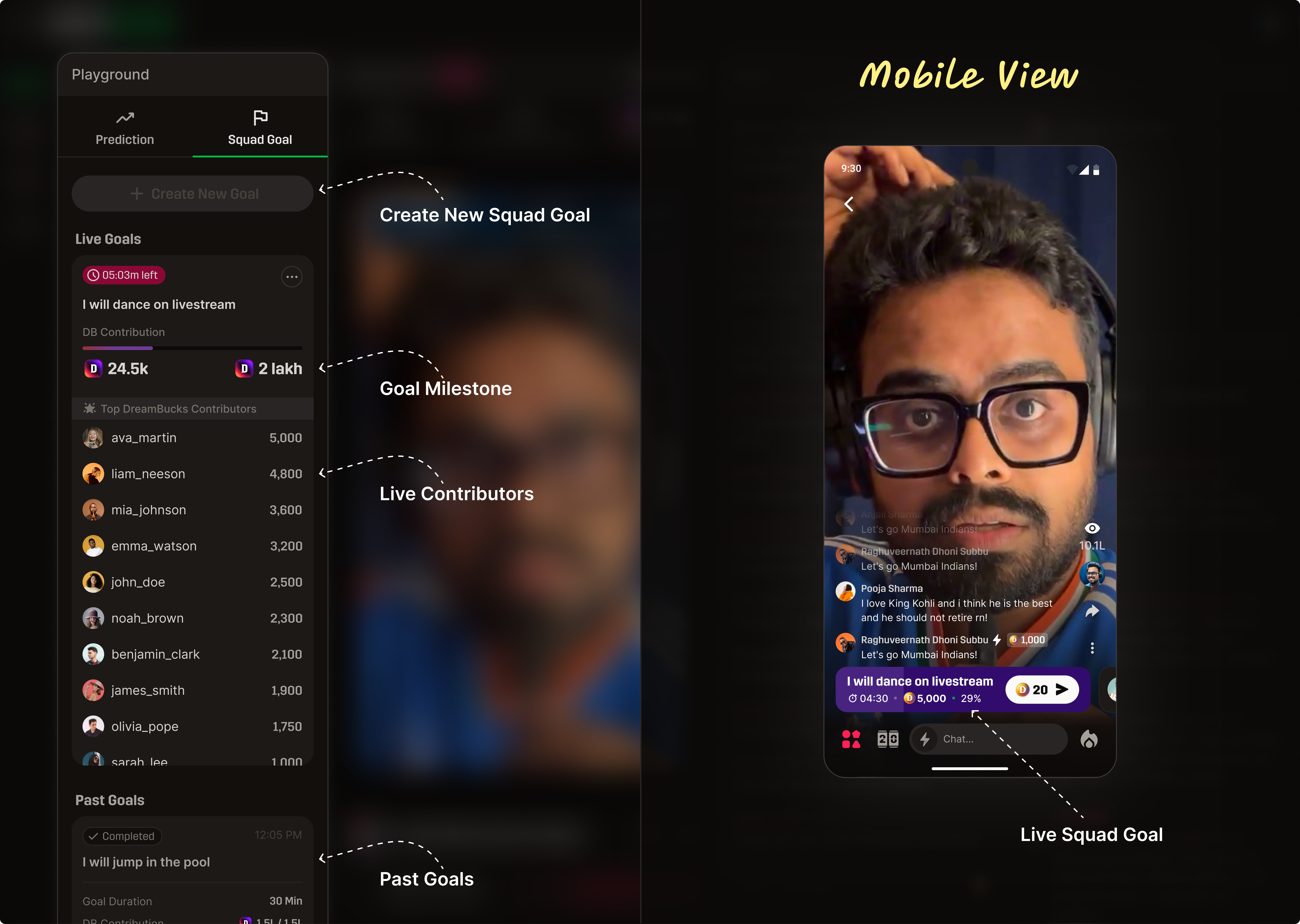
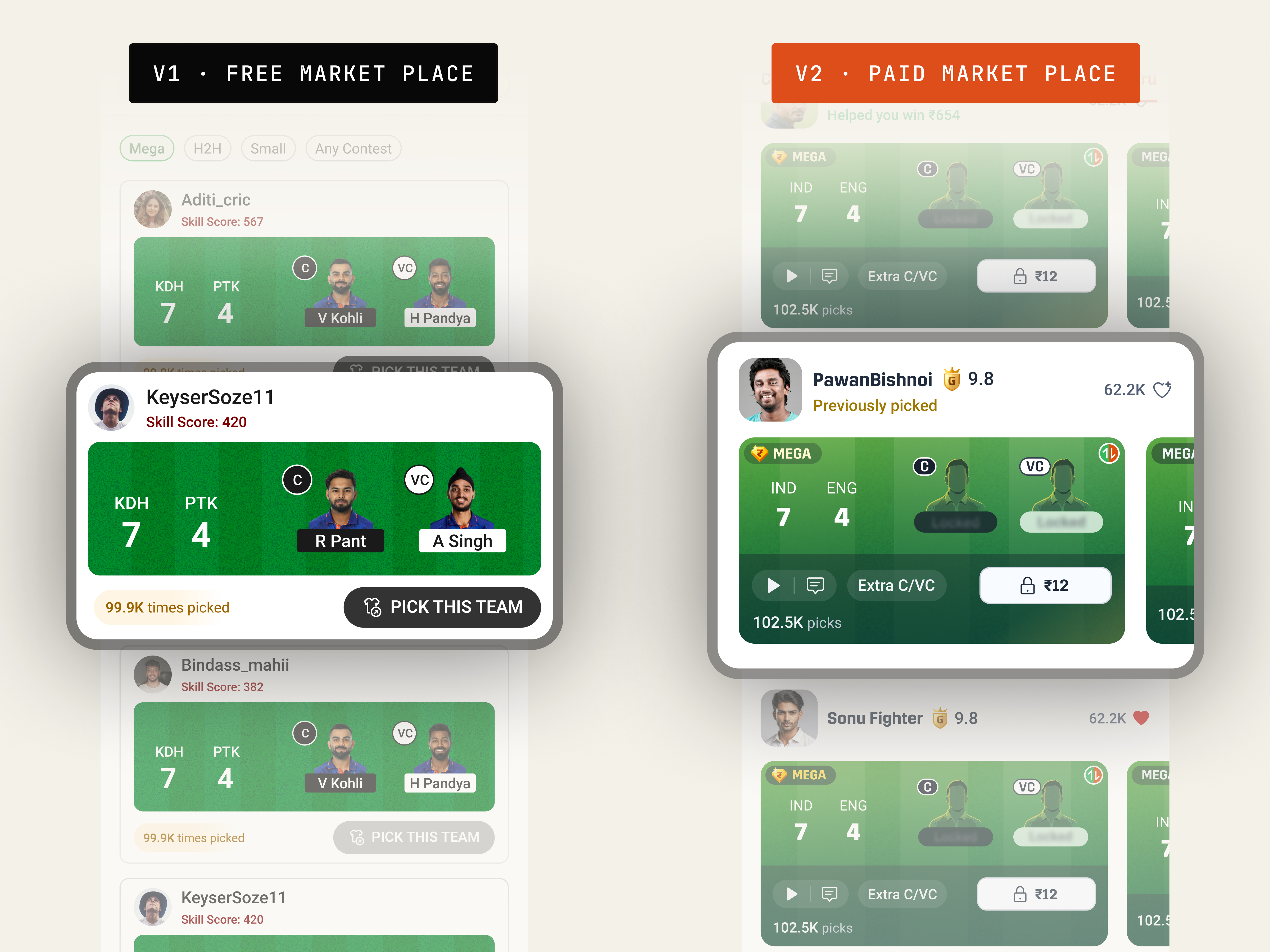
Creators need an audience before they need a wallet, so V1 led with loyalty tools like Squad Goals. Money was staged for later: engagement (v1) → loyalty (v1.5) → gifting & subscriptions (v2).
Some creators were mad, but we held firm. Twitch design warned us: "Once you introduce a currency you can't take it away."
Creators constantly scan chat while they talk, so we shoved everything else out of the primary view. Playground and Chat flank the stream; On Stage and Highlights sit pushed back.
On Stage became visually quieter and PMs fought it, but the scan-frequency data - and how Twitch handles layouts - won the argument.
For the stream to feel alive, all four of these steps have to be visible at once.
↻ every feature asks which beat does this serve?
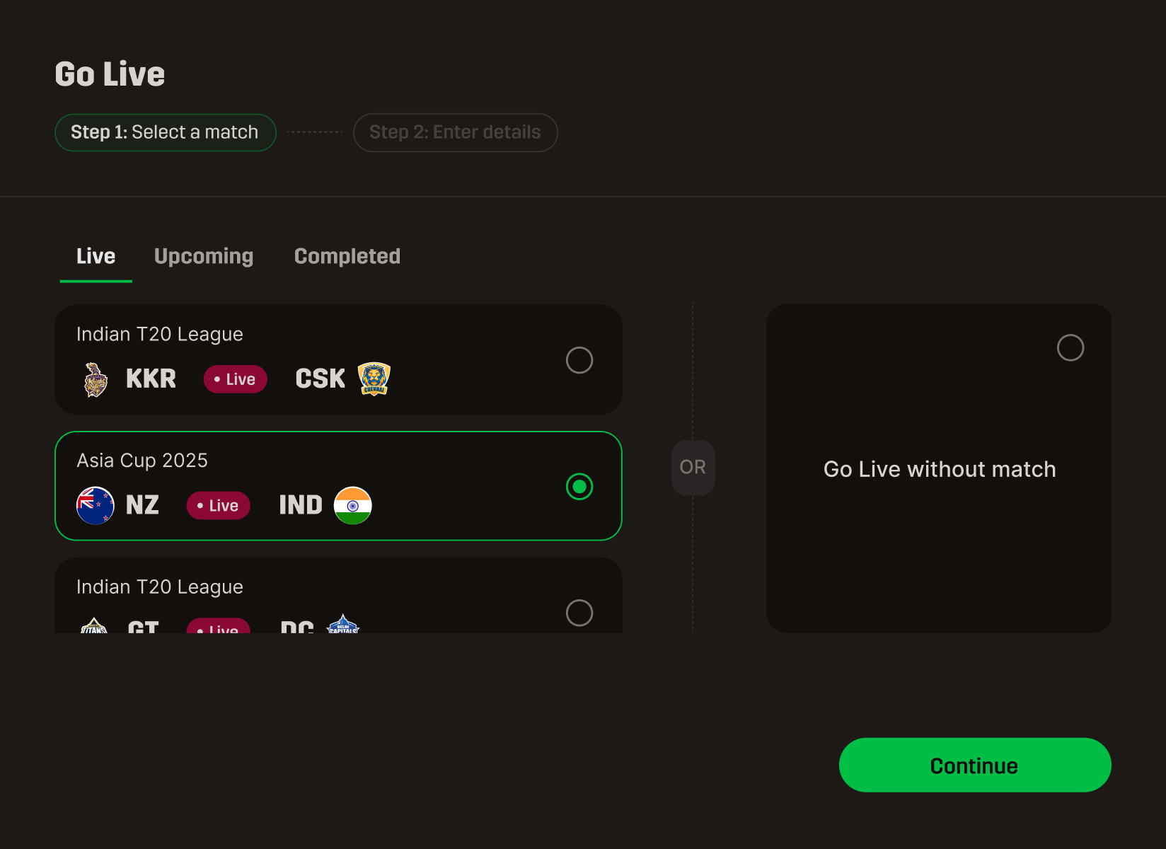
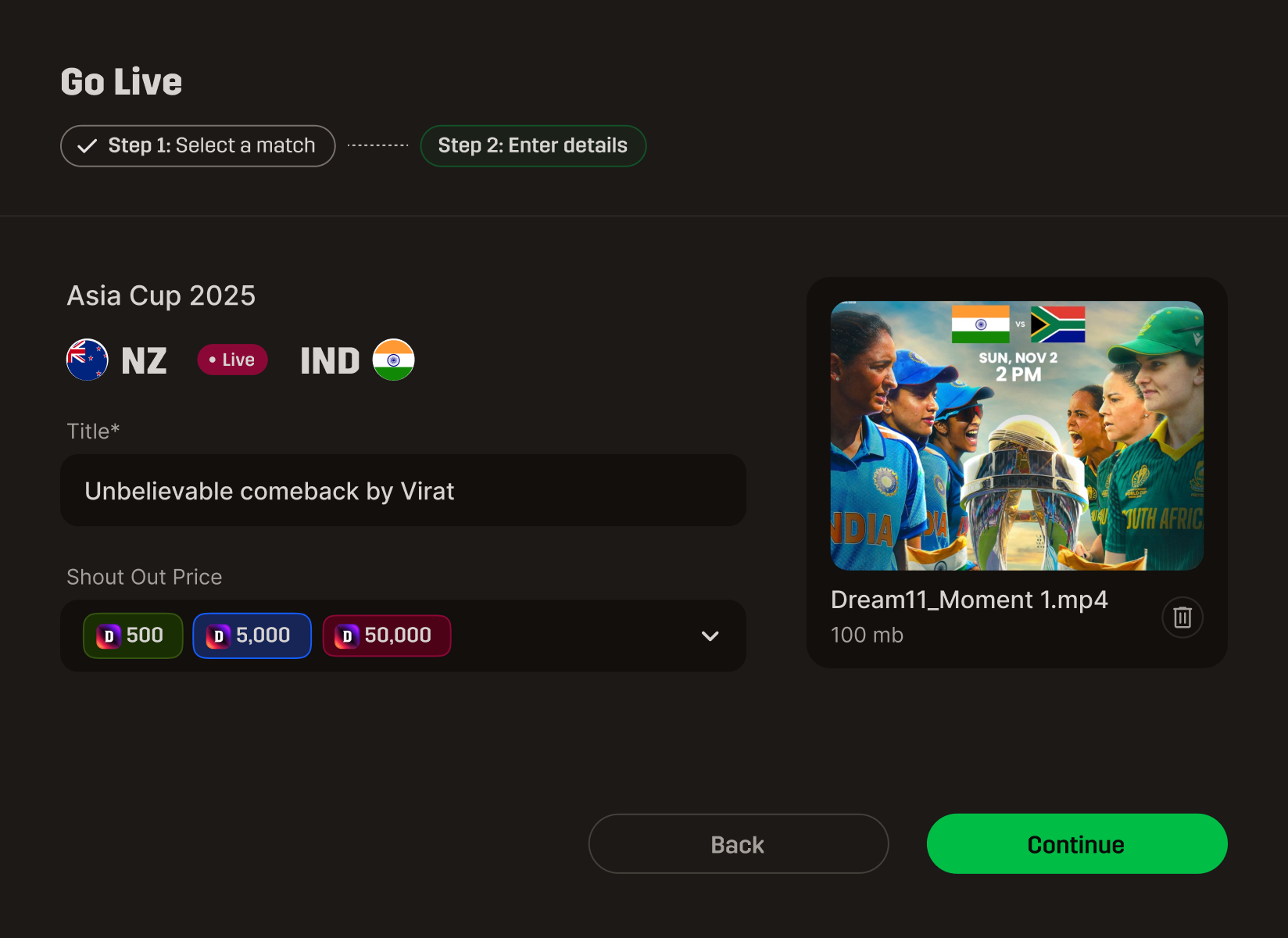
We cut all the fat. A creator can pull out their phone and start broadcasting before the coin toss.
We organized the dashboard purely by how often a creator needs to glance at it.
Everything was designed to drive interaction, not just look pretty.
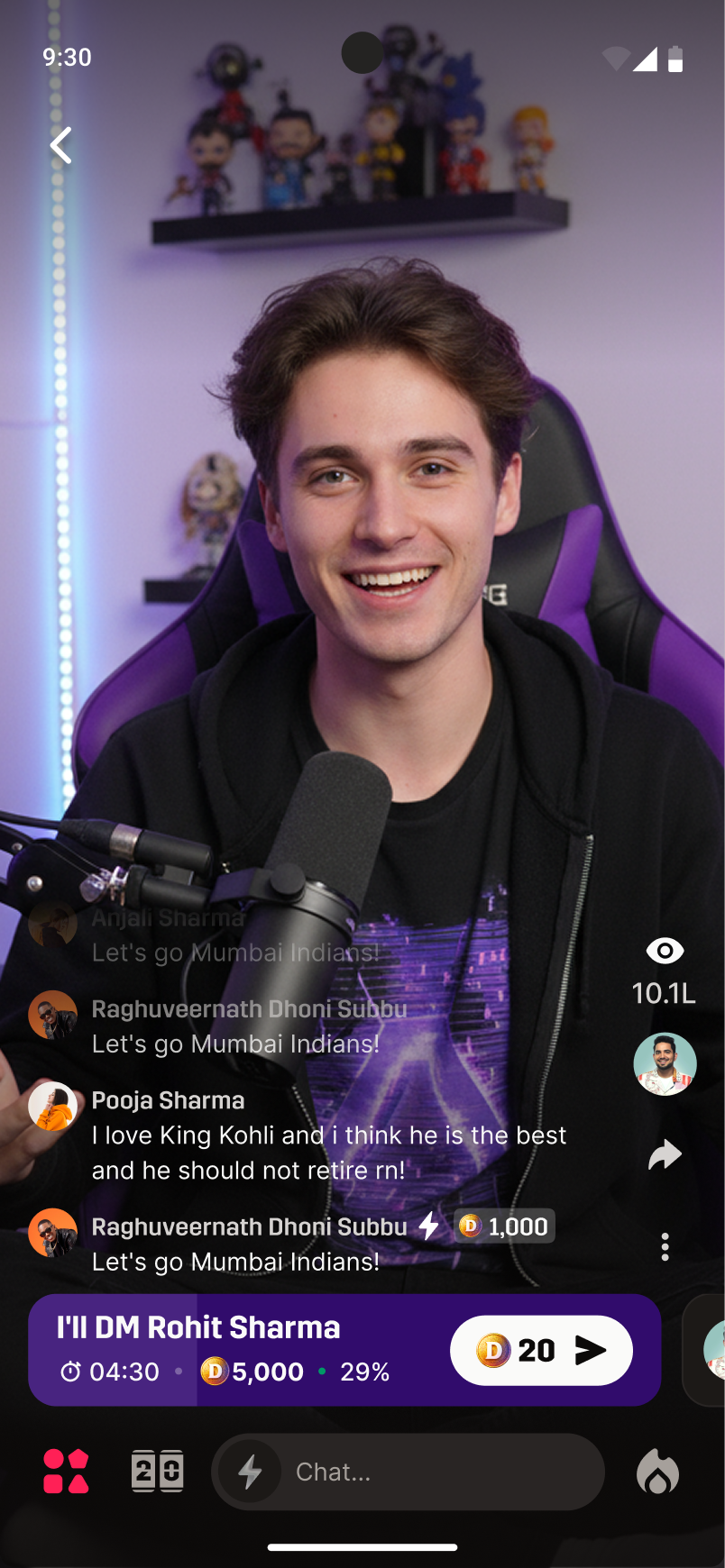
Squad Goals - a shared goal for the audience to hit together. It gives the room a common objective.
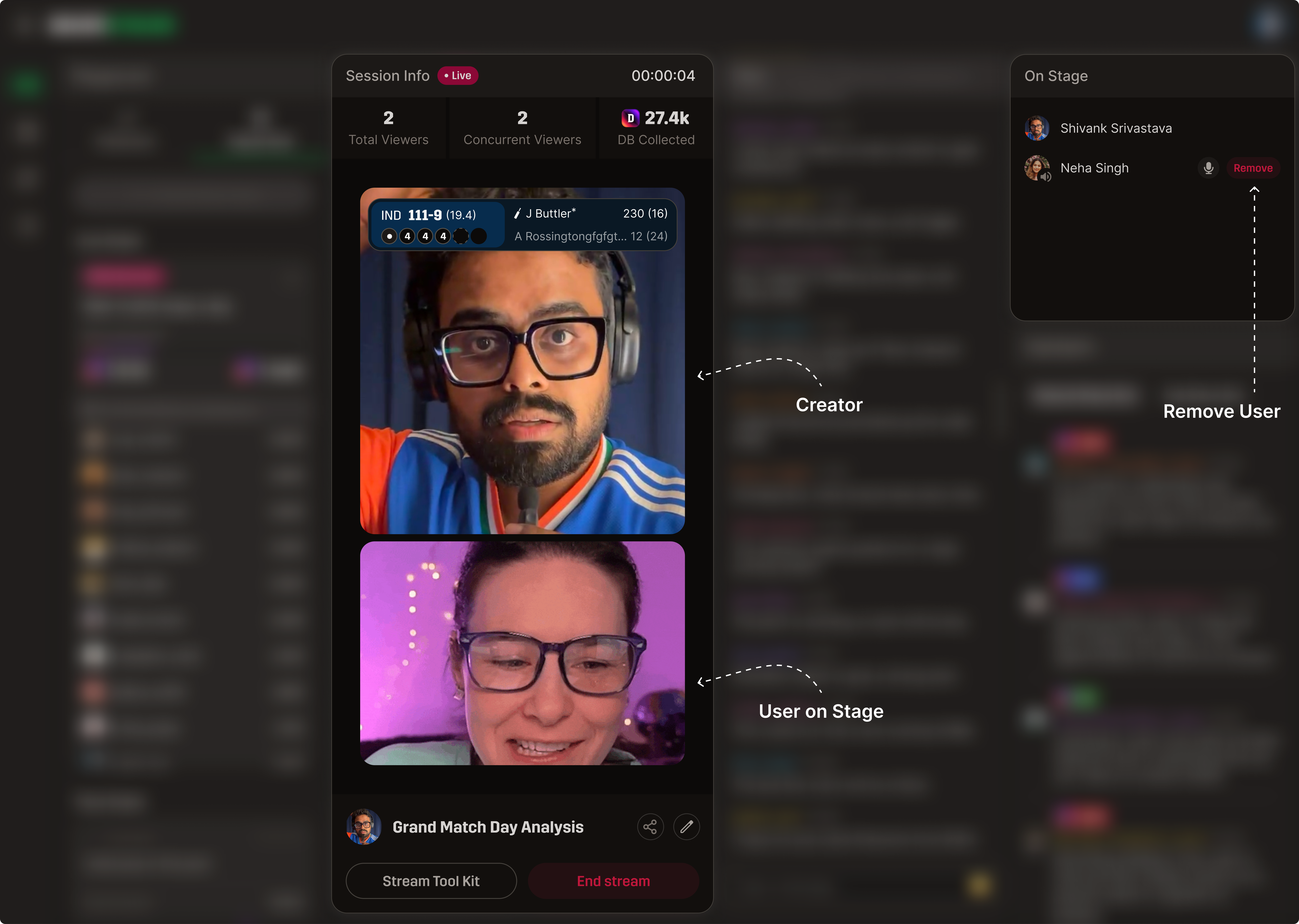
On Stage - brings a viewer directly into the live broadcast. When users see they might get pulled "on stage," they come back tomorrow.
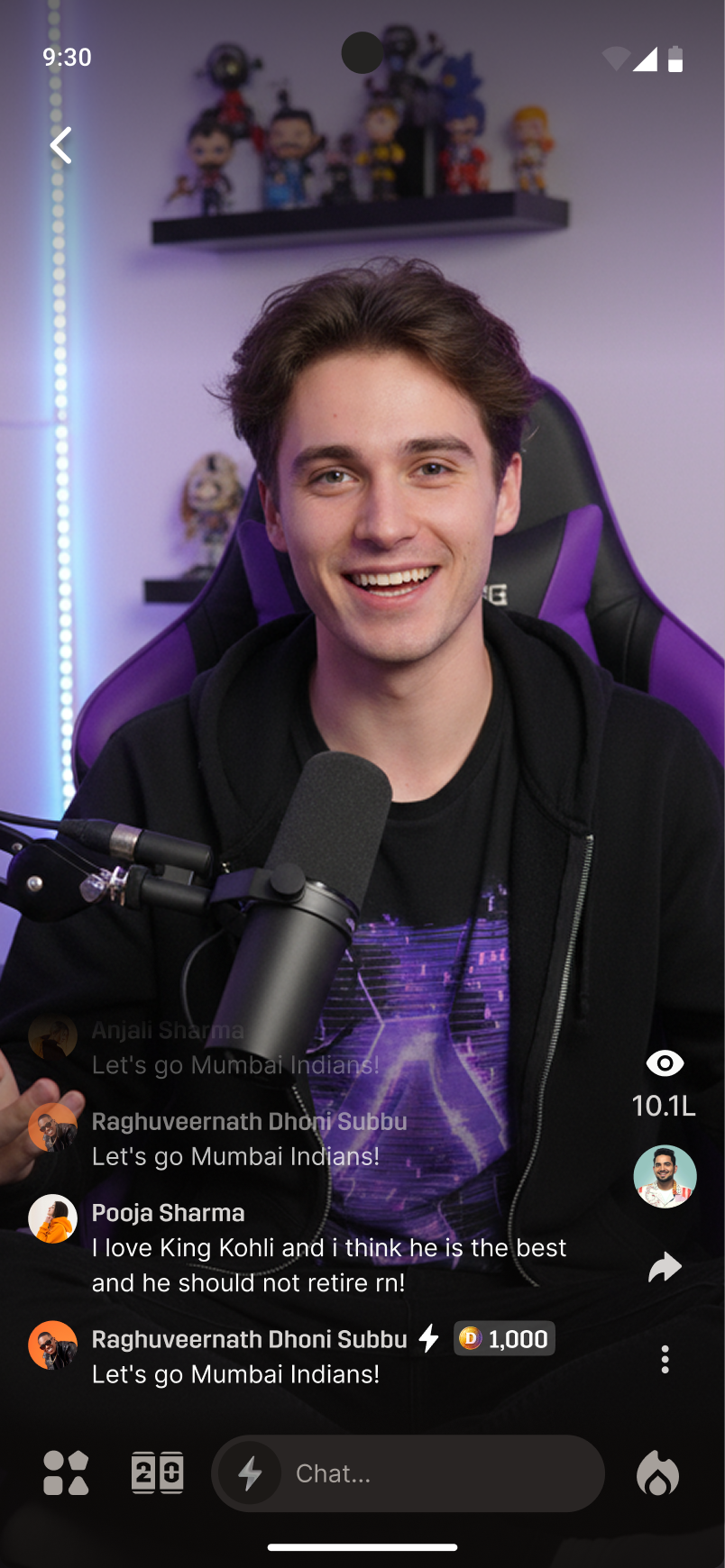
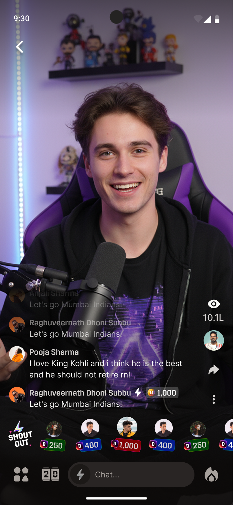
Chat & Shout Out - real-time tools to acknowledge the audience. It creates an immediate feedback loop.
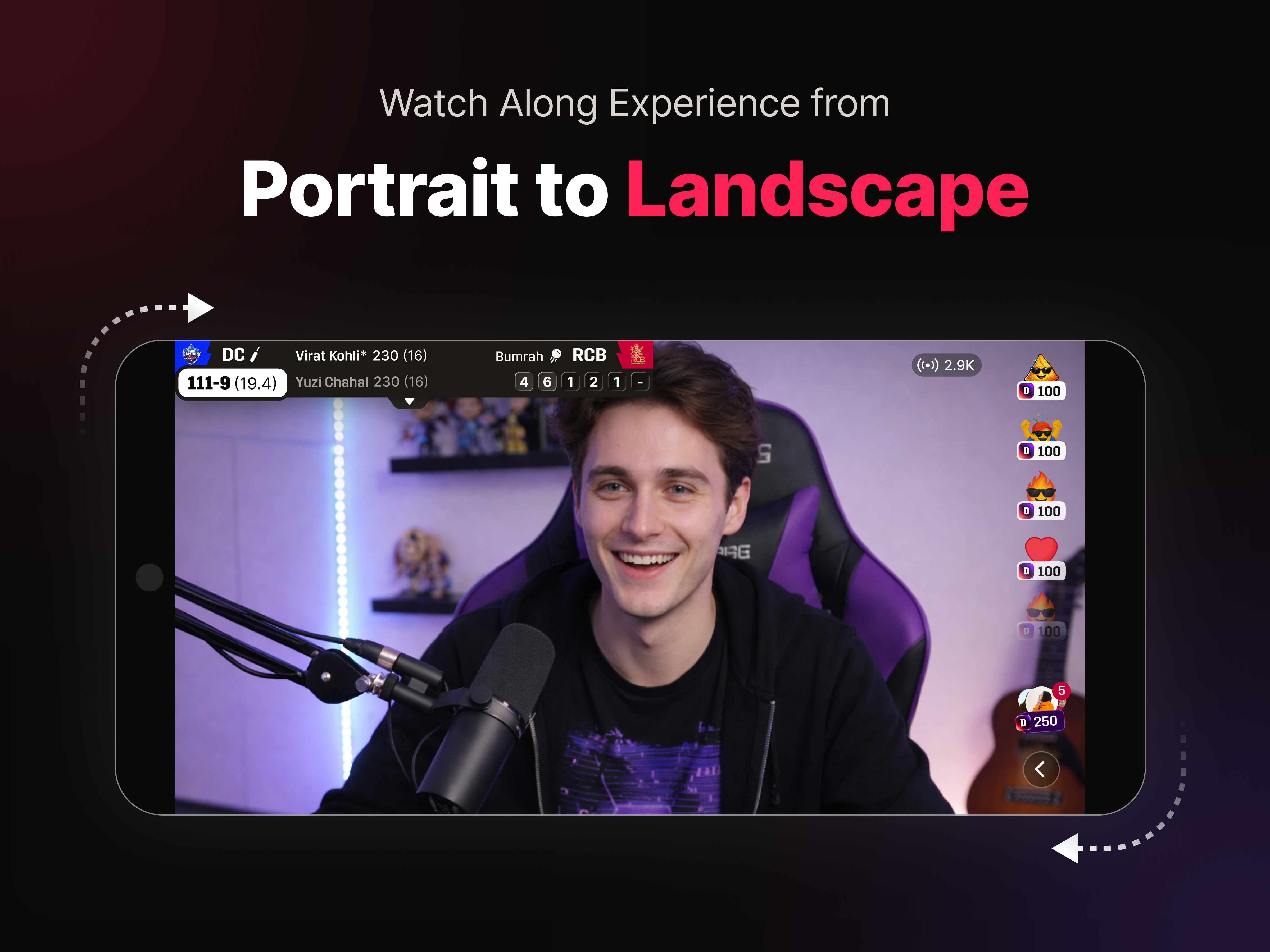
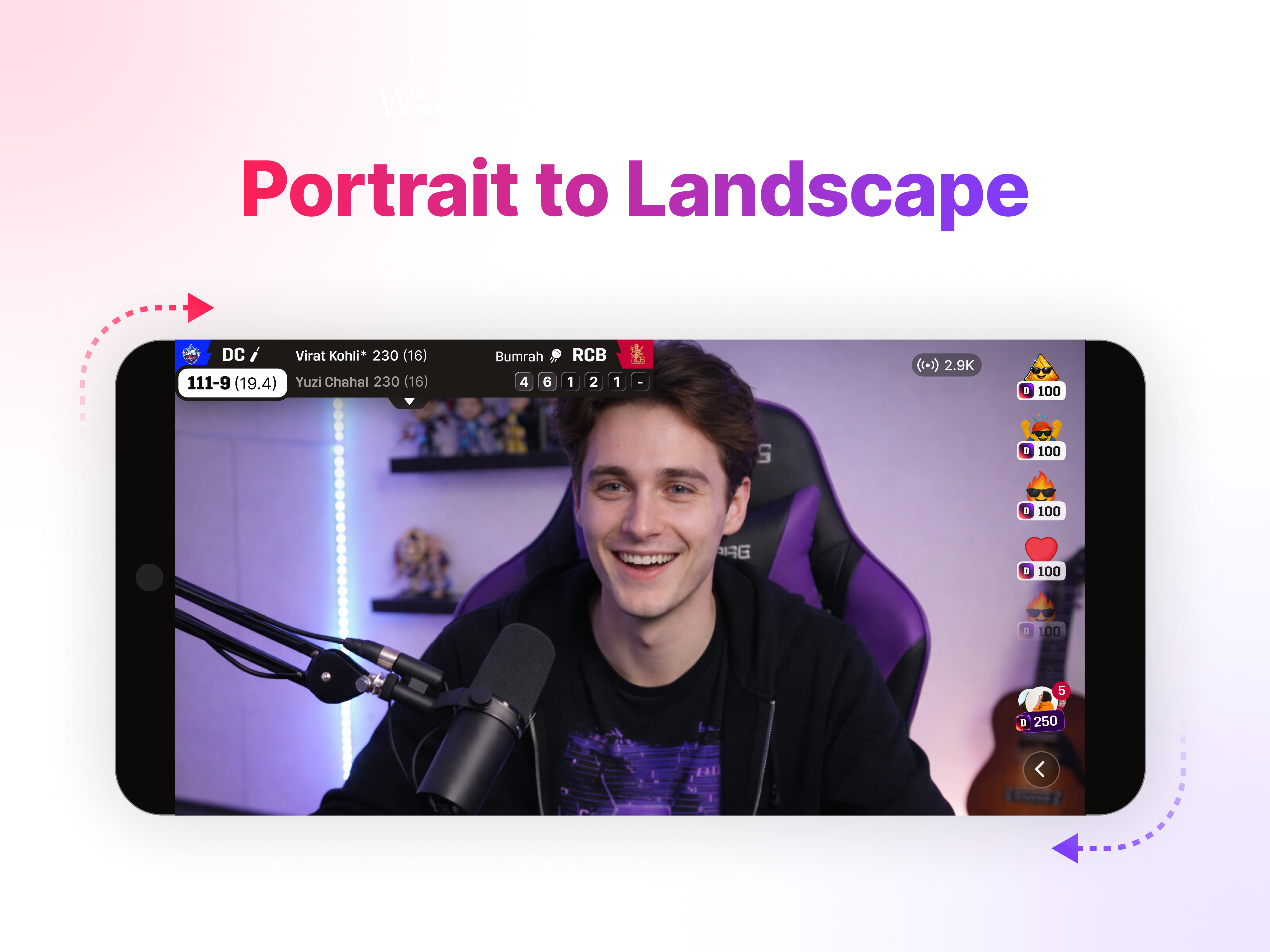
Creators got the complex desktop cockpit, but viewers just got a lively, streamlined mobile room.
Here is how our month-one numbers stacked up.
"Watching alone, missing the room." Viewers loved it - session times destroyed our older metrics.
"No home for sports-first livestreams." Creators adopted it, and we barely got any setup-confusion tickets.
"Owns the transaction, not the room." We finally gave 250M users a reason to stay for the whole match.
Skipping a design system helped us ship fast, but we paid the price in tech debt later. Next time, I'd force a one-week pause to build real tokens - the tradeoff between speed and scale.
Putting chat front-and-center while burying cooler features was a tough sell internally. But we trusted our observation data over personal taste - scan-frequency over feature prominence - and it worked.